
You've got the desktop version looking polished, the homepage hero finally lines up, and then a client opens the same page on a phone and the header jumps, the button text wraps badly, and a scrollbar appears where no one expected it. That's the moment responsive design testing stops feeling like polish work and starts feeling like damage control. If your site has already reached that point, the fix isn't more guessing, it's a better testing matrix, better tooling, and a clearer idea of which failures matter most.
Table of Contents
- Why Responsive Design Testing Became Non-Negotiable
- Choosing the Right Devices and Viewports to Test
- Testing Responsive Layouts with Browser Dev Tools
- When Emulation Is Not Enough and Real Devices Take Over
- Automating Responsive Checks Without Losing Coverage
- A Repeatable Workflow and Testing Checklist
Why Responsive Design Testing Became Non-Negotiable
A mobile review can fail on a detail that looked harmless during development. A headline clips by a few pixels, a menu closes late, or two tap targets sit too close together. Those defects often appear at the point where a visitor decides whether to continue, leave, or complete an action.
The shift happened because the web no longer serves a desktop-first audience by default. Mobile devices generated 54.4% of global website traffic at the end of 2021, 62.54% in Q2 2025, and about 63% in 2026, while one 2025 source reported 64.35% in July 2025 (HubSpot mobile optimization stats). The exact share varies by market and measurement period, but the testing requirement is consistent: a broken phone layout can affect the primary entry point to the site.
Practical rule: build your device matrix from analytics, then rank tests by the user actions and templates most exposed to failure.
Do not treat every viewport as equally important. Start with the screens, browsers, and operating systems used by visitors, then add representative widths and conditions that expose different layout classes. Prioritize actions such as opening navigation, submitting forms, reading content, using search, and completing checkout. This changes the question from “which breakpoints should we test?” to “which user actions fail under real conditions?”
Responsive design has also become the standard implementation pattern. In 2015, only 17% of websites used responsive design, while 21% used separate mobile URLs and 62% used neither approach. By 2025, industry summaries reported that 90% of all websites had implemented responsive design (DeviceAtlas). The result is a codebase that must hold together across phones, tablets, desktops, orientations, and intermediate widths.

Teams that still treat mobile as an afterthought can use a practical mobile-first layouts and CSS guide to reduce avoidable layout problems before formal testing begins.
The requirement extends beyond appearance. Google's mobile-first indexing rollout in 2018 reinforced the need to verify content, layout, interaction, accessibility, and performance on small screens. Browser emulators can reveal many visual defects, but they may miss touch behavior, keyboard focus, network delays, viewport changes, and device-specific rendering. Responsive testing therefore protects real user actions, not just the position of elements on a page.
Choosing the Right Devices and Viewports to Test
Testing every possible width is a trap. The problem isn't just phones, tablets, and desktops. It's the spread of orientations, safe areas, foldables, ultrawide screens, and browser chrome behavior that makes a single “mobile” test meaningless. One source even describes the space as having over 4 million possible browser-size combinations between 320×480 and 2048×2048 (QWE tutorial).
The useful move is to stop chasing every screen and start building a risk-based device matrix. Start with the devices your analytics show, then add a small benchmark set that catches the layout classes many teams miss. The usual widths still matter, especially 320px, 768px, and 1024px (Diffy responsive design testing), but they should anchor your plan, not define the whole thing.
A simple way to think about the matrix is template risk. Checkout, search, pricing, and article pages deserve the first pass because failures there usually carry the highest user cost. Secondary templates can wait until the core flows are stable. That triage approach is how small teams avoid spreading attention so thin that nothing gets tested well.
| Testing Layer | Catches Well | Common Blind Spots |
|---|---|---|
| Analytics-driven device matrix | Real visitor screens, top browsers, priority templates | Rare devices and orientations not seen in traffic |
| Standard breakpoint set | Core reflow behavior at common widths | In-between widths, weird interactions, foldables |
| Template triage | High-impact pages like checkout and search | Long-tail pages and low-traffic components |
| Full device sweep | Physical behavior and browser quirks | Scale, time, and maintenance overhead |
The best breakpoint planning resources still help, especially if they frame widths as part of a wider strategy. A useful example is planning responsive breakpoints, which is worth reading once you've decided what your actual test matrix needs to cover.
The question is not “what are all the screen sizes?” The question is “which screen sizes create the most business risk if they break?”
A quick note on process is worth keeping close. If you're building a WordPress publication, this guide to creating a WordPress blog is a useful internal reference point for how a site structure gets assembled before responsive QA begins. The page architecture matters because navigation, article templates, and sidebar behavior all influence what needs to be checked at each width.
Testing Responsive Layouts with Browser Dev Tools
A layout can pass a desktop screenshot and still fail when a user opens the menu, enters a form field, or scrolls through a long article at an awkward width. Chrome DevTools gives you the fastest first pass. Open responsive design mode, choose a device preset, set a custom viewport, and inspect the critical template before reaching for a physical phone.
Use analytics to choose the first pages and widths, then test the actions that matter on those pages. A checkout, search form, article menu, or image gallery can fail even when the surrounding layout appears stable. The goal is not to chase every screen size. It is to find where real visitor tasks break.
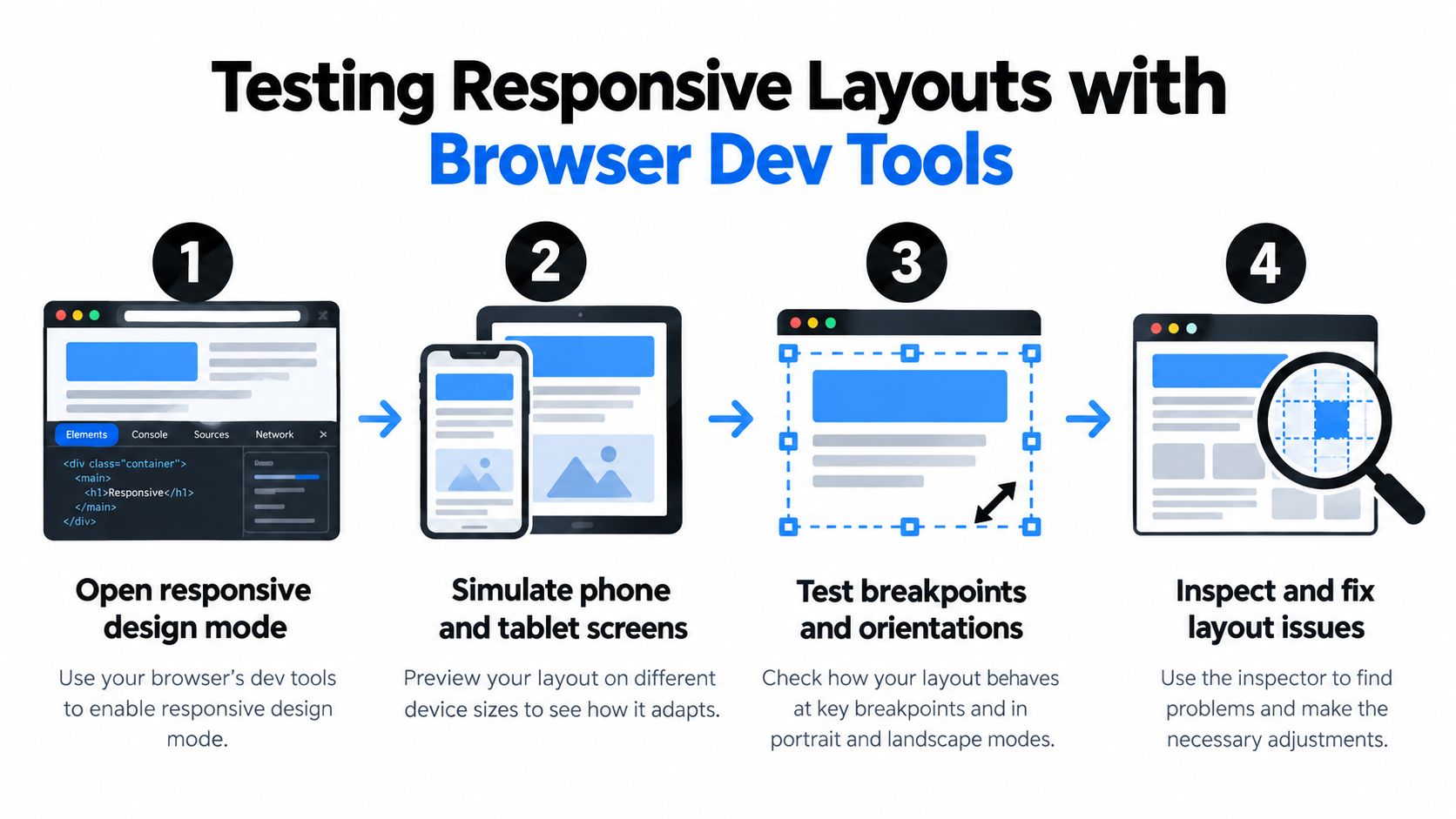
A practical DevTools workflow
- Open responsive mode and load a high-traffic template from your device matrix.
- Start at the narrowest relevant width, then increase it gradually instead of jumping straight to desktop.
- Drag the viewport slowly to expose flexbox edge cases, wrapping failures, fixed-width elements, and hidden overflow.
- Run the key user actions. Open menus, focus fields, submit forms, expand accordions, and move through keyboard focus.
- Throttle the network to check whether late images, scripts, or font swaps shift content or destabilize controls.
That sequence connects layout checks with interaction and performance checks. A page can remain visually intact while a menu becomes unreachable, a focused field moves off-screen, or content shifts after paint. DevTools exposes many of these defects before a real-device pass.
Template structure matters too. For layout patterns that hold up at every width, see our guide to the best WordPress blog layouts. Responsinator can provide a quick client-facing check by showing a live URL side by side across phone widths between DevTools passes. Chrome DevTools also includes responsive design mode for simulating phone and tablet screens directly from a computer (GoDaddy responsive testing tools).
Check screen matchMedia behavior when CSS or JavaScript depends on breakpoint-specific logic. Use verify screen matchmedia behavior to examine whether media-query conditions respond as expected while the viewport changes.

DevTools is fast and precise for structure, viewport changes, and scripted checks. It cannot reproduce every touch, browser-chrome, hardware, or connection condition. Use it to narrow the risk, then verify the highest-impact actions on real devices.
When Emulation Is Not Enough and Real Devices Take Over
Emulation is excellent for speed. It's weak at reality. A simulated phone screen can't fully reproduce touch behavior, browser chrome quirks, real-device DPI rendering, software-keyboard obstruction, hover-to-touch conversion, or how a page behaves under 400% zoom. Those are the bugs that look invisible on a laptop and annoying on a phone.
What real devices expose that emulators miss
On actual phones, the browser and the hardware interact in ways DevTools can't fake well. Tap targets that looked generous in simulation feel cramped with a thumb. A form field that seems fine on desktop may disappear behind the keyboard. A sticky header that works on a clean viewport can crowd safe-area insets or clash with device notches.
Recent guidance also calls out safe-area insets, mid-range Android hardware, and real 4G testing as necessary for surfacing issues that desktop tools miss (WebTonic responsive web design). That aligns with the practical experience teams have after a few painful launches, emulators are useful, but they're not enough for final sign-off.
Real-device verification should focus on actions, not just layouts. Can a user tap, type, scroll, zoom, and recover from interruptions without friction?
A strong real-device pass should include keyboard-only checks and throttled mobile audits. That matters because accessibility failures and performance failures often show up together on phones. If a menu is reachable only by hover, or a popover blocks the input the user needs next, the layout is technically present and practically broken.
The best rule is straightforward. Use emulation for early layout triage, then confirm critical pages on actual iOS and Android devices before release. If the page includes forms, filters, or dynamic navigation, the device pass isn't optional. It's the only layer that can tell you whether the experience still works under real fingers and real latency.
Automating Responsive Checks Without Losing Coverage
Manual testing cannot protect every commit. Automation keeps responsive checks running between releases, while human review handles the failures scripts cannot interpret. Build the suite around user risk, using analytics to identify the devices, templates, and actions that matter instead of chasing every possible screen size.
Visual regression tools work well when they run against critical templates at selected viewport sizes. They catch unexpected spacing changes, altered grids, and components that shift after a CSS or markup update. Screenshot checks remain limited, though. A pixel difference may be harmless, while a state-dependent bug, keyboard obstruction, or failed touch target may leave the image looking correct.
Use automation to test layout relationships and visibility rules alongside screenshots. Assertions can verify that navigation is available, the hero does not cover the CTA, containers stay within bounds, and form controls remain reachable. Add action checks for opening menus, entering text, submitting forms, scrolling through sticky elements, and recovering after validation errors. These checks answer a more useful question than “which breakpoint failed?” They show which user action breaks.
| Approach | What It Does Well | Where It Breaks Down |
|---|---|---|
| Screenshot comparisons | Detects fast visual regressions | Flags valid changes and misses interaction failures |
| Layout assertions | Checks structure, visibility, and relationships | Requires deliberate test design |
| Action-based tests | Verifies menus, forms, focus, and touch flows | Needs maintenance as components change |
| Continuous runs | Catches regressions on each commit | Can create noise without risk-based scope |
| Human review | Interprets context and intent | Cannot cover every release or device |
A small WordPress team may also need a quick preview tool rather than a full CI setup. The WordPress Responsive Page Tester adds a Responsive button to the toolbar and displays the site in an overlay at different sizes. It can expose obvious visual issues before formal QA, but it does not prove that touch, focus, or performance behavior works.
AI visual checkers can help sort likely layout changes, yet they may miss foldable hinge states, hover-to-touch transitions, focus order, and slow-device behavior (QWE tutorial). Treat their output as a triage signal, not a pass/fail gate. Keep the automated suite narrow enough to maintain, then reserve real-device and human checks for the interactions analytics shows carry the most risk.
A Repeatable Workflow and Testing Checklist
The workflow that holds up in real teams is simple enough to repeat and strict enough to catch the expensive misses. Start with your highest-traffic templates, define the widths that matter, sweep them in DevTools, confirm on real devices, then automate the regressions that keep coming back. That sequence scales better than ad hoc testing because each layer does one job well.
Use this order
- Baseline critical templates: Start with checkout, search, and article pages before lower-value screens.
- Sweep widths in DevTools: Move from the smallest viewport upward, and drag slowly between breakpoints.
- Check real devices: Confirm touch behavior, keyboard interaction, and rendering on actual phones and tablets.
- Run automated comparisons: Keep responsive regressions from slipping back into later commits.
- Throttle the network: Test slow-loading states, not just ideal desktop conditions.
The most common mistakes are still the easiest to avoid. Teams test only a few standard widths, rely on emulation exclusively, or skip performance under throttled networks. Those shortcuts save time early and create rework later.
Start with two or three highest-traffic templates this week. That's usually enough to surface the bugs that matter most, and it gives you a pattern you can expand without rebuilding the process.
The point of responsive design testing isn't to cover every possible device. It's to protect the user actions that fail most often under real conditions. If you keep the matrix tied to analytics and the workflow tied to actual page risk, the process stays manageable instead of turning into screen-size theater.
Read More Info publishes practical WordPress content, and this topic fits the kind of site work it already supports, from responsive layouts to core publishing workflows. If you're tightening your own QA process, visit Read More Info for more WordPress-focused guidance you can apply to a live site.