
You can spot a broken responsive layout in seconds. The desktop mockup looks polished, but on a phone the navigation wraps badly, text feels cramped, and one image pushes half the page off-screen. That gap between “looks fine on my laptop” and “falls apart on a phone” is exactly what responsive design principles are meant to close.
A good responsive site doesn't just shrink content. It preserves reading order, keeps controls usable, and lets the layout respond to the device instead of fighting it. If you've ever opened a page and thought the website looks weird on phone, that's the problem space Bruce and Eddy describe well in their explainer on website looks weird on phone. For a broader reference hub, Read More Info keeps its content simple to scan, which is the same mindset good responsive work should follow.
Table of Contents
- The Reality of Modern Multi-Device Browsing
- The Three Pillars of Responsive Web Design
- Viewport Mechanics and Media Queries
- Fluid Grids and Content-Driven Breakpoints
- Beyond Viewports with Container Queries
- Accessibility and Performance as Responsive Defaults
- Implementing Responsive Principles in WordPress
The Reality of Modern Multi-Device Browsing
A layout that only works at one width is a fragile layout. The moment a reader switches from a big monitor to a phone, the page has to negotiate with a narrower space, different touch behavior, and a shorter attention span. Fixed-width thinking used to be normal, but it breaks down fast once real people move between devices all day.
That's why responsive design became a baseline rather than a bonus. The idea is to make one site adapt cleanly to many screens, not to build a separate experience for every device class. If the content stays readable, the buttons stay tappable, and the page stays ordered, users don't have to work to understand it.
What usually breaks first
The first failures are predictable. Navigation gets crowded, images overflow their containers, and side-by-side sections that felt elegant on desktop become unreadable stacks or tiny columns on mobile.
Practical rule: if a section only works when the browser window stays wide, it isn't finished yet.
That's why teams often start with the user's frustration, not the code. A useful framing is to ask whether the page still makes sense when the screen gets smaller, the connection gets slower, or the input method changes from mouse to thumb. The easier it is to answer yes, the closer the site is to real responsive design. If you want a quick overview of how publishing sites can stay simple and readable, Read More Info is a practical place to browse that kind of structure.
The Three Pillars of Responsive Web Design
Responsive design started as a named concept in 2010, when Ethan Marcotte described a single site adapting to many screens through fluid grids, flexible images, and media queries in a May 2010 A List Apart article, later summarized on his own site at Responsive Design at 10. That three-part structure is still the cleanest starting point for the discipline.
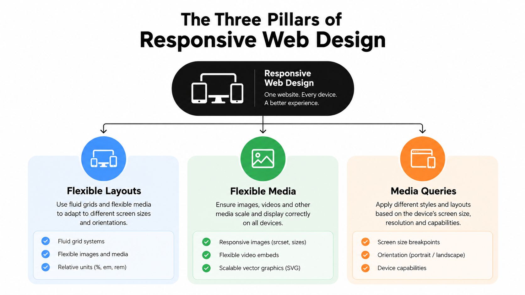
The first pillar is the layout itself
A fluid grid means widths are relative, not fixed. Instead of locking a column to one rigid size, you let it scale with the available space. That's the difference between a page that survives resizing and one that fractures under it.
The second pillar is media that can flex
Images and other embedded media need to stay inside their containers. If they're allowed to keep a fixed width, they'll blow apart the layout on smaller screens. The practical fix is to let media scale with the space around it so the composition holds together.
The third pillar is conditional styling
CSS media queries apply different styles when the browser matches certain conditions, usually width or orientation. That's what makes a layout shift from one column to two columns, or from compact navigation to expanded navigation, without rebuilding the page.
DesignStack's overview of user experience on any screen is a useful companion here because it keeps the focus on the outcome, not just the technique. By 2012, media queries had become part of mainstream standards, which pushed the field from a clever idea into standard practice. The important lesson is simple, the pillars work together. If one is missing, the whole structure gets shaky.
Viewport Mechanics and Media Queries
Mobile browsers don't always treat a page the way desktop browsers do. Without the right setup, they often assume a wider layout viewport, then scale the page down to fit the screen, which makes breakpoints behave unpredictably. MDN's guide to Responsive Design explains why the viewport meta tag matters here, and why width=device-width, initial-scale=1 aligns the layout viewport to the actual device width.
That setting matters because it tells the browser to stop guessing. Once the viewport matches the device, media queries can do their job with much more precision. If you skip this step, the browser may render your layout as if it has more room than it really does, which is why some sites feel “responsive” in the code but not in the hand.

What media queries can actually target
Media queries are more flexible than many juniors expect. They can respond to width, height, orientation, and touch capability, so the page can adapt to more than just screen size. That's useful when the problem isn't just “small screen” but “small screen held in portrait mode with touch input.”
A breakpoint should match a change in behavior, not a random device model.
That's the reason clean responsive systems feel calm. The browser gets one clear instruction set for phones, another for tablets or layouts, and the page changes only where it needs to. The best results come when the viewport is configured correctly first, then media queries add the adjustments that matter most to the experience.
Fluid Grids and Content-Driven Breakpoints
The old habit was to design for device presets. You'd pick a phone size, a tablet size, and a desktop size, then force the layout to fit each one. That approach still appears in a lot of tutorials, but it's less useful than it looks because content rarely cares about brand-name devices.
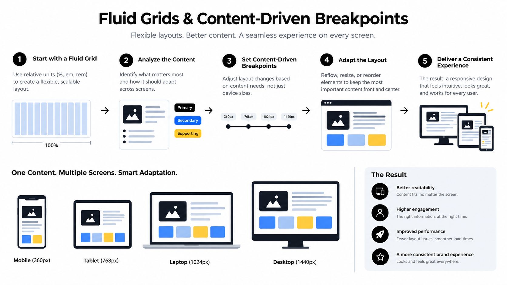
The better approach is to let the content tell you where the layout fails. Web.dev's responsive web design basics recommends fluid grids, flexible media, and breakpoints based on failure points rather than arbitrary presets. That shift sounds small, but it changes how you think about layout. You stop asking, “What device is this?” and start asking, “Where does this arrangement stop working?”
Why relative units make layouts calmer
Units like rem, vw, and percentages let elements scale with context. That gives you a layout that grows and shrinks without snapping to hard edges. W3Schools' guidance on responsive design also reinforces the mobile-first habit of starting narrow and enhancing upward, which pairs naturally with relative sizing.
Images need their own rules
A responsive grid still fails if images don't cooperate. Use maximum-width constraints, lazy loading, and aspect-ratio so images don't overflow, jump around, or shift the page while loading. That's especially important in blog layouts, where a single oversized image can break the reading rhythm.
For WordPress-specific layout planning, best WordPress blog layouts is a useful reference point because the structure of the page affects how easily content can adapt across screens. When the content flow is clean, breakpoints become simpler. When the content is overcrowded, every breakpoint becomes a rescue mission.
Beyond Viewports with Container Queries
A lot of people still think responsive design stops at the browser width. That's understandable, because media queries have been the default teaching tool for years. But modern interfaces need something more local than page-wide breakpoints, especially when the same component appears in different parts of a layout.
Container queries solve that problem by letting a component respond to the size of its parent container instead of the whole viewport. That matters for reusable cards, sidebars, and modules that appear in narrow or wide contexts depending on where they're placed. Scrimba's responsive web design guide captures this shift well, especially the distinction between media queries for page structure and container queries for reusable components.
Where media queries still belong
Media queries still make sense when the page itself changes shape. They're good for rearranging the major layout, moving navigation, or changing overall spacing across screen sizes. If you need to alter the architecture of the page, page-level breakpoints are still the right tool.
Where container queries fit better
Container queries shine when one component needs to adapt inside different wrappers. A product card, for example, might sit in a wide grid on desktop and a narrow column on mobile. The component shouldn't care about the whole screen, only the space it has.
Modern guidance also favors intrinsic layouts, fluid scales, and clamp() for typography and spacing. That combination reduces the need for endless breakpoint patches. The cleanest way to think about it is this, media queries shape the page, container queries shape the parts.
Accessibility and Performance as Responsive Defaults
A site that looks responsive but fails basic reading or interaction checks isn't really responsive. It may resize, but if the text is hard to read, the touch targets are awkward, or the page feels sluggish on weaker devices, the experience still breaks down. The 2025 Web Almanac's accessibility findings at Accessibility make that gap hard to ignore, since the median Lighthouse Accessibility score improved only slightly year over year to above 85, while just 31% of mobile sites met minimum color contrast requirements.
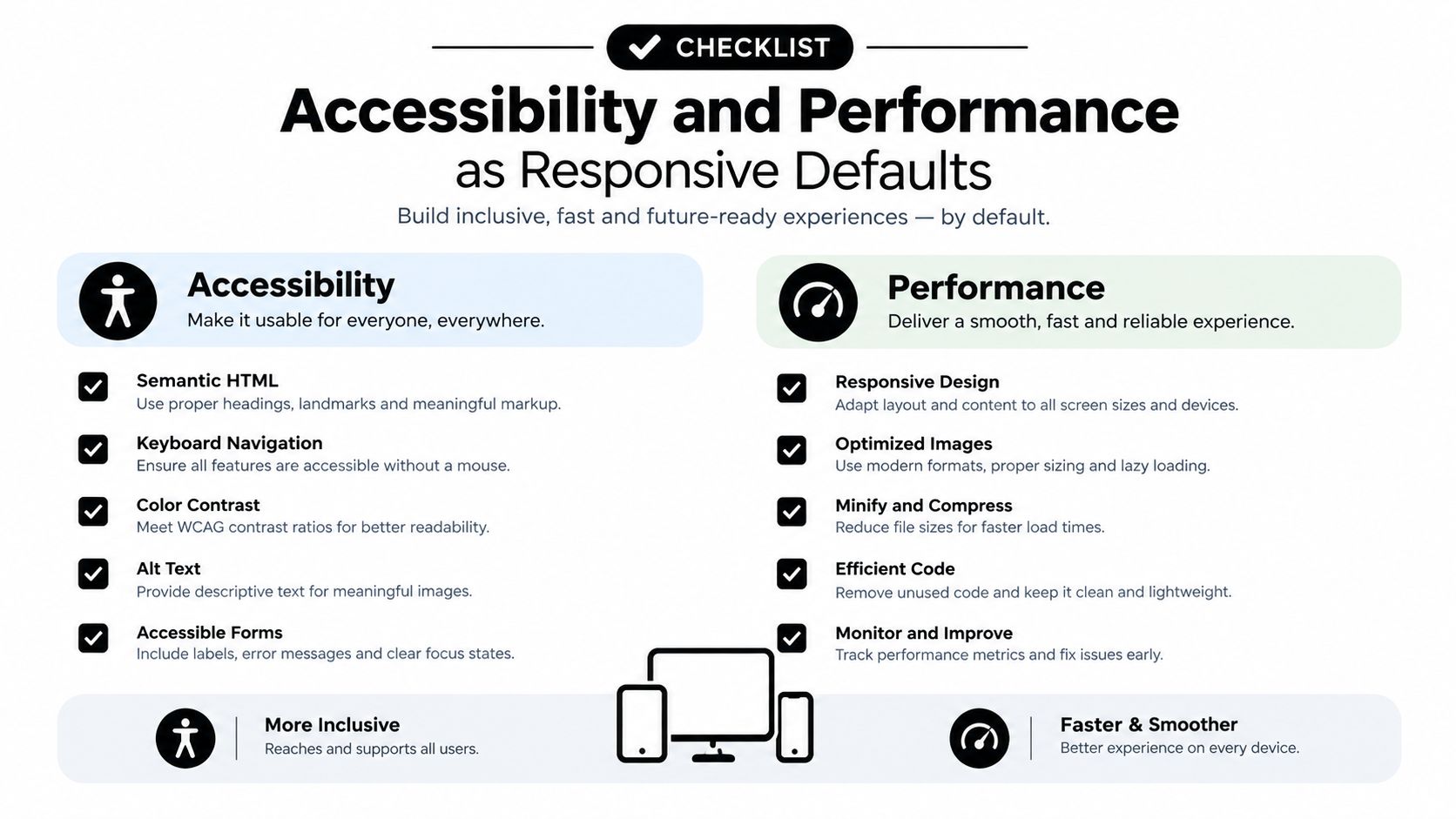
That tells you something important. Many sites have learned how to adapt visually, but not how to stay usable under real constraints. Responsive thinking has to include contrast, keyboard navigation, touch targets, and reduced-motion settings, not just width-based breakpoints.
Build for constrained devices, not ideal ones
Performance matters because responsive layouts often run on phones, older tablets, and slower networks. If the page depends on heavy scripts or oversized media, the design may technically fit the screen and still feel broken to use. That's why responsive work and performance work belong together.
Accessibility belongs in the layout layer
Color contrast affects whether text is readable. Keyboard navigation affects whether interactive pieces can be reached at all. Reduced-motion settings matter when animations become part of the interface. These aren't extras, they're part of whether the design responds to the user.
A practical audit starts with the basics. Check reading contrast, verify that controls can be reached without a mouse, and make sure nothing important depends on hover alone. If the site still feels usable after those checks, the responsive system is doing real work.
Implementing Responsive Principles in WordPress
WordPress makes responsive publishing easier when the theme is lightweight and the HTML stays semantic. That matters because clean structure is easier for browsers, assistive tech, and search systems to understand. The WordPress blog setup guide is one useful reference point if you're thinking about a simple publishing workflow instead of a heavy custom app.
WordPress also ships with open feed endpoints. The platform documents a site-wide comments RSS feed and a separate comments feed path in its feeds handbook, and WordPress.com documents the site comments feed structure at Feeds. That kind of syndication fits the same philosophy as responsive design, simple, standards-based access that works across tools and devices.
A practical audit checklist
- Keep the theme lightweight: Favor semantic HTML and minimal default styling so pages render cleanly on small screens.
- Check reading flow: Headings, paragraphs, and images should stack in a way that still feels natural when space is tight.
- Use built-in feeds: Site content and comments should be easy to subscribe to without extra plugins or proprietary tools.
- Test the reading experience: Search, empty states, and archive pages should still make sense on phones.
Read More Info itself follows that straightforward publishing model, with a basic WordPress structure, search, and RSS access for content and comments. That's a useful reminder that responsive design isn't only about flashy UI work, it's also about making ordinary content easy to consume anywhere.
If you want a practical way to apply these ideas to your own site, explore Read More Info for straightforward WordPress publishing examples, simple site structure, and content patterns that stay readable across devices. Then compare your own layout against those basics, especially on mobile, where responsive design principles either hold up or fail fast.