10 Best Feed Reader Android Apps for 2026

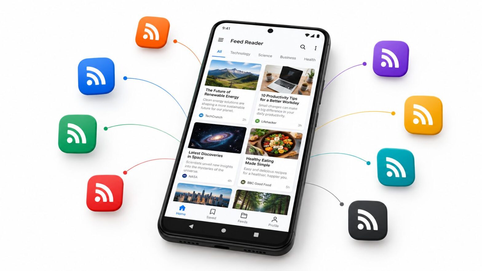
The popular advice says the best feed reader Android users can choose is the app with the most downloads, the highest store rating, or the longest feature list. That approach misses the actual decision. A reader that excels at cloud discovery may be poor for private, offline reading, while a lightweight local app may frustrate anyone who needs cross-device sync, newsletters, or advanced monitoring.

This comparison evaluates ten Android feed readers by the reading problem they solve. The practical criteria are Android usability, synchronization, feed handling, full-text access, offline behavior, privacy, paid limits, notification control, and setup effort. The list includes cloud services, local apps, open-source clients, self-hosted backends, discovery tools, filtering systems, and knowledge-capture workflows.

RSS still connects readers to a very large open web. BuiltWith trend data records 38,136,800 live websites using RSS and 86,771,786 total websites identified as RSS customers, which helps explain why Android readers remain useful despite the decline of individual reader apps. RSS trend data also puts the category in context: the value is aggregation across many publishers, not dependence on one closed platform.

Read More Info is a useful example of the publishing model. It's a lightweight WordPress publication with public content and comments feeds, so you can test how a reader handles both articles and discussion updates. If you're also building a publication, practical feed clickthrough rate tips can help turn subscriptions into visits.

Table of Contents

1. Feedly

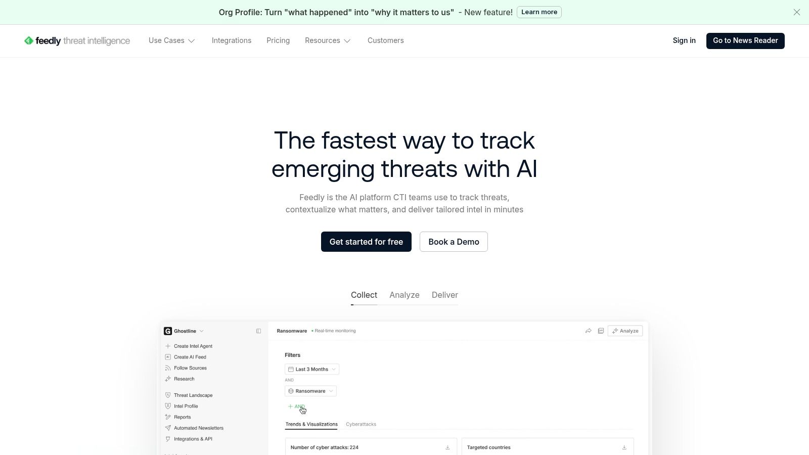
Feedly is the safest recommendation for readers who want a polished cloud service without spending time configuring every part of the system. Its Android app works alongside web, desktop, and iOS access, and the interface makes it easy to discover publications, arrange folders, save articles, and return to unfinished reading.

Best for discovery and cross-device continuity

Feedly is particularly effective when your reading list changes often. Discovery tools help you find sources by topic, while filtering and mute controls reduce repeated or irrelevant coverage. Newsletter ingestion, RSS Builder tools, automations, and integrations extend the service beyond ordinary feed reading, especially for research and content workflows.

The trade-off is control. You'll need an account, and the most powerful filtering, search, newsletter, and automation capabilities sit behind paid plans. Offline reading is also less compelling than in Android-first apps designed around local caching.

Practical rule: Choose Feedly when convenience across devices matters more than keeping every subscription and article entirely on your phone.

For a non-technical user, Feedly's onboarding is easier than assembling a self-hosted stack. It's also a sensible front end for a WordPress blog because public RSS feeds can be added without special publishing work. Choose it for polished discovery, integrations, and organizational scale, not for a local-only privacy model.
Feedly

2. Inoreader

Inoreader suits people who treat RSS as a monitoring system rather than a casual newspaper. The Android app connects to the service's web and iOS clients, keeping subscriptions, folders, saved items, and reading decisions available across devices.

Best for rules and site monitoring

Its strength is granular control. Rules can route articles, apply tags, trigger automations, or separate high-priority material from general reading. Inoreader can also follow websites without conventional RSS feeds and turn newsletters into feeds, which is valuable when important sources publish inconsistently.

That flexibility creates a steeper learning curve. A casual reader may find the settings excessive, while advanced features and higher limits require Pro or Team plans. Plan structures have evolved, so check the current terms before building a workflow around a particular capability.

For monitoring, Inoreader is more suitable than a simple local reader because the service can watch sources and process incoming material continuously. It's a strong fit for analysts, editors, marketers, and anyone tracking competitors or niche topics. It can also handle a publication such as the Read More Info blog as one source within a larger monitoring system.

Use Inoreader when: Your problem is not finding feeds, but deciding what should trigger an alert, receive a label, or disappear from the main queue.

The app is powerful, but it can make reading feel like administration if you only follow a small group of sites.

3. NewsBlur

NewsBlur is a veteran reader for people who want filtering that learns from their reading without handing the entire experience to an opaque algorithm. It has native Android and iOS apps plus a web interface, so it works for users who move between phone and computer.

Best for human-guided filtering

NewsBlur's intelligence training lets you indicate which stories, topics, and sources deserve attention. That approach is useful when a feed is valuable but noisy. Instead of abandoning the source, you can teach the service which patterns matter and use different views to move between the original page, a readable text version, and an expanded article.

The “Read the Full Story” behavior is important for feeds that publish excerpts. The “Original Site” view provides a fallback when extraction doesn't work. Per-feed mobile notifications are also practical for a small number of high-priority sources, although enabling alerts for everything quickly recreates the interruption problem RSS is supposed to solve.

Premium plans are needed for capabilities such as broad full-text search and larger site counts. That's a reasonable trade if you value a straightforward service model, but less attractive if you want a completely local setup.

NewsBlur works best when you want privacy-minded filtering and dependable reading modes rather than a large automation platform. It's less focused on newsletter ingestion and knowledge management than Feedly or Readwise Reader, but it handles imperfect feeds with useful flexibility.

4. Readwise Reader

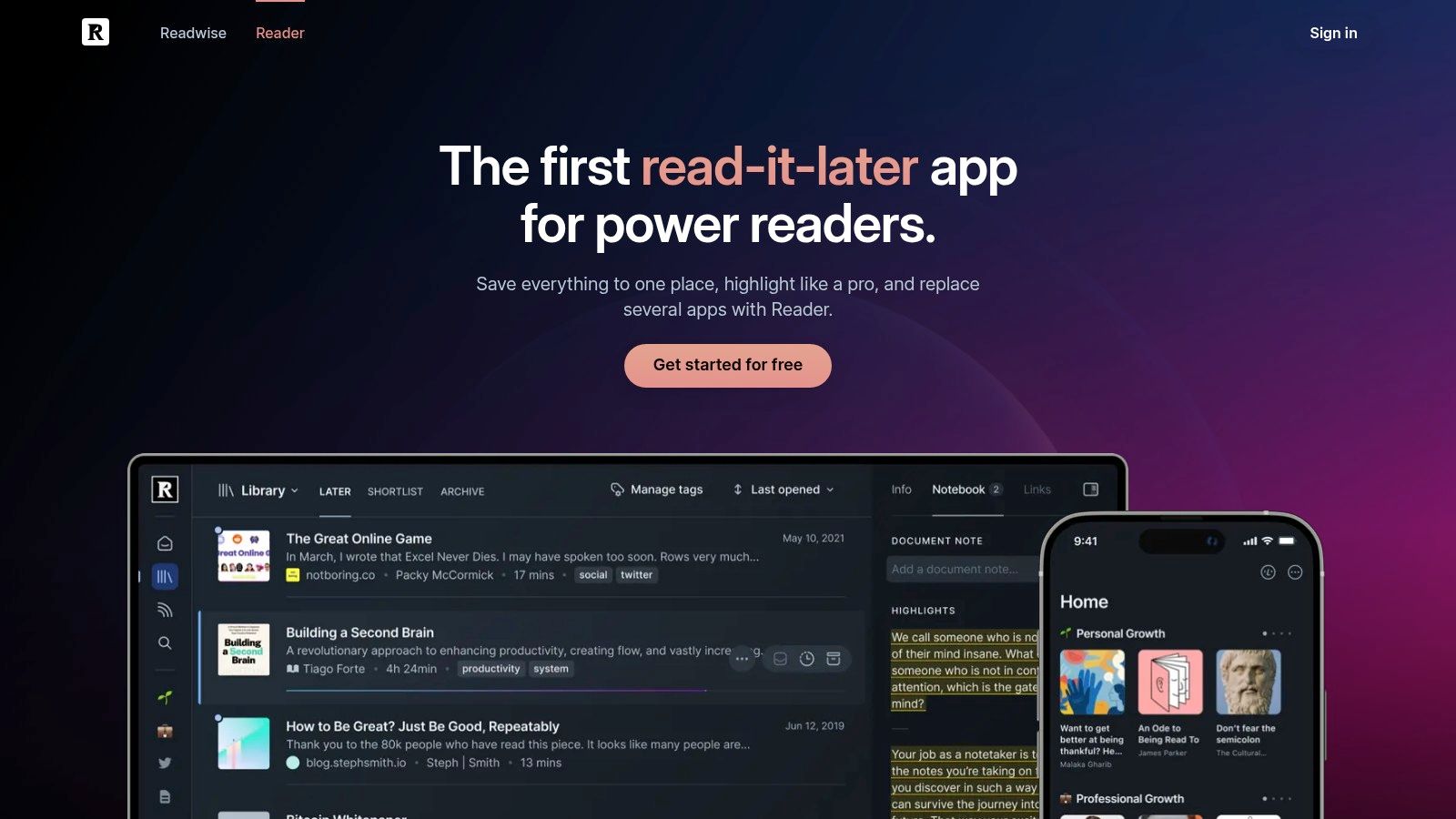
Readwise Reader is not merely an RSS inbox. It combines feeds with newsletters, saved web pages, PDFs, and EPUBs, then gives you tools for highlighting, annotation, review, and export.

Best for turning reading into knowledge

The distinction matters. A conventional feed reader helps you process headlines and articles. Readwise Reader is designed for the next step, when you need to preserve an argument, mark a passage, or move research into Obsidian, Notion, or another notes system.

Its Android, iOS, desktop, and web access make the workflow portable. Offline controls help when you want to prepare a reading queue before commuting, while article highlights and annotations remain useful after the original feed item leaves the front page. AI-assisted reading and review can support summarization, but the core value is still the annotation pipeline.

The cost is higher than that of a basic RSS app. After the free trial, Readwise requires a subscription, so it's difficult to justify if you only want a stream of headlines. It also introduces more concepts than a minimal reader, including document types, highlights, exports, and review workflows.

Reading insight: If you regularly save articles but rarely revisit them, a reader with strong annotation and review tools may solve a bigger problem than a faster inbox.

Choose Readwise Reader for knowledge capture, research, and long-form reading. Choose something else if privacy, local storage, or a no-account setup is your primary concern.
Readwise Reader

5. Feeder

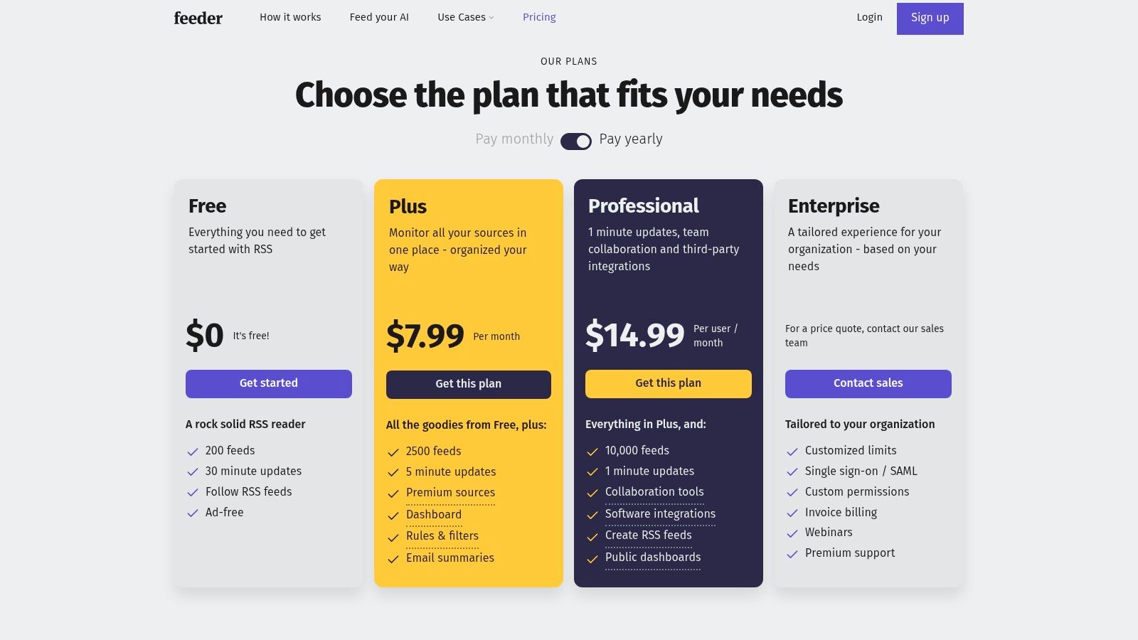
Feeder keeps the reading experience focused. Its Android app emphasizes straightforward subscriptions, quick updates, push notifications, OPML import, and a clean interface rather than a broad ecosystem of research features.

Best for alerts without excessive complexity

Feeder is a good choice when a feed matters because it publishes timely updates. You can configure notifications around selected sources instead of relying on a general news app's algorithm. That makes it useful for release notes, industry announcements, company blogs, and publications where missing a new item has a practical cost.

The setup is uncomplicated, and the plan structure is easy to understand. Team-friendly features add value for shared workflows, while frequent polling and larger limits are reserved for higher plans. If you follow a large number of feeds or need extensive history, those limits deserve attention before you commit.

Feeder's privacy-minded positioning makes it more appealing than a reader built around social recommendations. Still, it's a cloud service, so it isn't the same as a local-only reader with no account. Faster updates and advanced capabilities may also require payment.

A strong implementation starts with a small set of alert-worthy feeds. Use ordinary feeds for background reading, then reserve push notifications for sources that justify immediate attention. That distinction keeps Feeder useful instead of turning it into another notification channel.

Feeder

6. FeedMe

FeedMe is the practical pick for Android users who care about offline reading, speed, and backend flexibility more than visual polish. It can work locally with OPML imports or connect to services including Feedly, Inoreader, BazQux, The Old Reader, Tiny Tiny RSS, and FreshRSS.

Best for commuters and heavy skimmers

FeedMe's offline behavior is its clearest advantage. You can download articles and images before leaving a reliable connection, then read through a queue without waiting for every page to load. Text-to-speech and gesture controls make it suitable for hands-free listening or fast, one-handed triage.

An independent Android benchmark found FeedMe had the fastest sync latency among eight actively maintained clients, with a median 1.42 seconds from feed-update notification to a fully rendered article list across 500 RSS sources on Android 14 using identical Pixel 7 Pro devices. The same benchmark measured 11.8 MB RSS idle RAM for FeedMe, compared with 41.5 MB for Feedly. The benchmark details make memory and responsiveness meaningful selection criteria for mid-range phones and busy background-app environments.

A separate task-completion evaluation found that a highly rated reader took 4.83 seconds on average to display and scroll to the first full paragraph, more than 2.6 times slower than FeedMe, while using 217 MB of RAM during background sync. That Android evaluation illustrates why store ratings don't always predict reading speed or resource cost.

The compromise is an utilitarian interface. FeedMe rewards configuration and repeated use, but it won't feel as immediately refined as Feedly.

FeedMe (by Seazon)

7. FocusReader

FocusReader concentrates on the Android reading surface. Its Material interface, gesture navigation, readability options, translation tools, and per-feed full-text controls make it appealing when the act of reading matters more than administration.

Best for comfortable full-text reading

The app supports a broad range of backends, including Feedly, Inoreader, The Old Reader, Feedbin, BazQux, Tiny Tiny RSS, FreshRSS, and Fever. That gives you a polished front end without forcing you to abandon a service or self-hosted system you already trust.

Its readability pipeline is useful for difficult feeds. A publisher may provide only a short excerpt, use cluttered markup, or format its page in a way that performs poorly inside ordinary readers. FocusReader can offer a more consistent article view and translation when language is part of the reading workflow.

The trade-off is business-model friction. Some capabilities require in-app purchases, and development may feel less predictable than with larger hosted services. You'll also want to test the feeds that matter most, because full-text extraction can vary by publisher.

FocusReader fits readers who spend substantial time inside the Android app and want gestures, typography, and navigation to feel deliberate. It's less suitable if you want a completely local, account-free reader.

8. Read You

Read You takes the local-first route. It's a free, open-source Android reader built with Kotlin and Jetpack Compose, using a Material You design that feels current without requiring a cloud account.

Best for local control and simplicity

Read You manages feeds locally and supports OPML import and export. That's enough for readers who want to subscribe, browse, save a small number of items, and keep control of where subscriptions live. Distribution through F-Droid and GitHub also suits users who prefer open-source release channels.

The absence of sign-in is the central benefit. You don't have to create another service account, hand subscriptions to a hosted provider, or accept a cloud layer merely to read public feeds. That makes Read You a strong fit for privacy-conscious users who read primarily on one Android device.

There's a real limitation, though. Built-in service integrations are narrower than those of Feedly, Inoreader, FeedMe, or FocusReader. If you switch frequently between phone and desktop, need server-side search, or want a shared reading state, local simplicity can become manual work.

Choose local storage when: Your priority is reducing dependence on a service, and you're comfortable giving up some cross-device convenience.

Read You is not the most powerful app in this list. It's one of the clearest answers for lightweight, private, account-free RSS reading.

9. Readrops

Readrops sits between a local app and a commercial cloud reader. It's open source, supports local use, and connects to self-hosted services such as FreshRSS and Nextcloud News.

Best for self-hosted synchronization

This is the right direction for readers who want multi-device sync without placing their subscriptions in a large commercial platform. Your server becomes the source of truth, while Readrops provides the Android interface for reading, sorting, and keeping progress consistent.

The setup requires more ownership than Feedly or Feeder. You need a compatible backend, a working server, and a willingness to handle updates and troubleshooting. That effort is worthwhile for users who already run FreshRSS or Nextcloud, but it's unnecessary for someone who only wants to follow a few public blogs.

Readrops has a Material 3 redesign and Android 14 compatibility, and it's distributed through F-Droid, GitHub, and the Play Store. Its open-source model reduces vendor lock-in and keeps software costs near zero, although a smaller development team can mean that bug fixes and feature changes take longer than they do in a commercial product.

Use Readrops when private sync is the problem. Use Read You when local reading is enough. Use FeedMe when you need to connect to several kinds of hosted or self-hosted backends from one Android client.

10. Fluent Reader Lite

Fluent Reader Lite is aimed at readers who want a clean mobile companion to the Fluent Reader desktop ecosystem. Built with Flutter for Android and iOS, it keeps the interface lightweight and avoids the density of a monitoring platform.

Best for a minimal cross-platform setup

OPML import makes the initial move straightforward, while simple full-text reading handles the basic job of opening articles without sending you through a maze of options. Regular releases and public issue tracking provide useful visibility for open-source users.

Fluent Reader Lite works well when your needs are modest: follow feeds, read items, keep a consistent experience between desktop and mobile, and avoid unnecessary account layers. It isn't designed to replace Inoreader's rules or Readwise Reader's annotation system.

That limited scope is both the attraction and the weakness. Heavy users may miss deeper filtering, richer offline controls, advanced notifications, or broad backend integrations. A minimalist app can also feel incomplete if your reading workflow has grown into research, team sharing, or content automation.

For a small personal feed list, Fluent Reader Lite is refreshingly direct. It's especially suitable for people who already use Fluent Reader on desktop and want the same general philosophy on their phone. It also pairs naturally with a publication built around simple WordPress blog layouts, where clear content matters more than a complex reading interface.

Top 10 Android Feed Readers, Comparison

ReaderCore features ✨UX / Quality ★Price / Value 💰Best for 👥Standout 🏆
FeedlyAndroid/web/iOS, AI filters, newsletter→RSS, many integrations★★★★ polished, easy onboarding💰 Freemium (Pro/Pro+/Enterprise)👥 Non-technical users & teams🏆 Discovery & integrations
InoreaderRules/automations, web feeds, fast updates, newsletter→feed★★★★ power-user controls💰 Freemium (Pro/Team for higher limits)👥 Power users & site monitors🏆 Granular filters & rules
NewsBlurIntelligence training, per-feed notifications, Original/Text view★★★★ privacy-minded, reliable mobile💰 Affordable paid tiers, transparent👥 Privacy-focused readers🏆 Flexible view modes & feed expansion
Readwise ReaderRSS + newsletters + PDFs, highlights, exports to Obsidian/Notion★★★★ focused on knowledge workflows💰 Subscription after trial (higher-end)👥 Researchers & note-takers🏆 Best highlight/export workflow
FeederFast polling, push notifications, OPML, team features★★★★ minimal, dependable alerts💰 Freemium (Plus/Pro/Enterprise)👥 Users needing timely alerts🏆 Reliable push notifications
FeedMe (Seazon)Excellent offline download, TTS, sync with many backends★★★★ optimized for heavy skimming💰 One-time / affordable paid app👥 Commuters & offline readers🏆 Best Android offline experience
FocusReaderMaterial UI, readability/full‑text, translation, many backends★★★★ polished, fast navigation💰 Free + in-app purchases👥 Android users switching services🏆 Readability & translation pipeline
Read YouLocal feeds, OPML, Material You, no sign-in (FOSS)★★★★ clean, lightweight💰 Free & open-source👥 Privacy-preferring local users🏆 No-account, open-source simplicity
ReadropsMulti-backend (FreshRSS/Nextcloud), Material 3, FOSS★★★★ self-host friendly💰 Free & open-source👥 Self-host/FreshRSS users🏆 Seamless self-hosted sync
Fluent Reader LiteCross-platform mobile, OPML, simple full-text reading★★★★ distraction-free, consistent💰 Free & open-source👥 Users pairing with desktop app🏆 Lightweight mobile + desktop parity

Choose the Reader You Will Actually Use

The best feed reader Android users can choose depends on where reading friction appears first. Feedly is the practical starting point for polished discovery, easy onboarding, cross-device sync, and integrations. Inoreader is better when you need rules, monitoring, web feeds, newsletter ingestion, and granular automation.

Choose NewsBlur if you want human-guided filtering, flexible article views, and a privacy-minded service model. Choose Readwise Reader if the important result isn't marking an article read, but extracting an idea, annotating a passage, and moving it into your knowledge system.

Feeder is the notification-focused option. It's a good fit for readers who want dependable alerts and a straightforward interface without turning every subscription into a complicated workflow. FeedMe is the strongest choice for heavy Android reading, offline queues, backend interoperability, and efficient skimming.

FocusReader suits users who care about reading comfort, readability tools, translation, and the freedom to connect different backends. Read You is the clean local open-source option for people who don't want an account. Readrops is the better answer when you want private synchronization through FreshRSS or Nextcloud News. Fluent Reader Lite works for a minimal mobile experience that complements its desktop ecosystem.

RSS also remains a practical open publishing layer. WordPress sites include built-in feeds, and adding /feed/ to a site address is the standard way to access the main feed. WordPress also provides /comments/feed/ for following discussion activity, while its documentation distinguishes comment-only feeds from feeds containing site content. WordPress feed documentation explains the public endpoint pattern, and the developer documentation for comment feeds covers site-wide and per-post discussion feeds.

Read More Info makes a useful test case because it offers both the main article feed and the comments feed. Add the content feed first, then test whether your chosen app can display article text cleanly, cache it for offline use, preserve unread state, and handle new discussion entries without mixing them into the main reading queue.

Keep the implementation small at the start:

  • Subscribe selectively: Begin with a few reliable feeds instead of importing every source you've collected.
  • Use OPML when moving: Export an OPML file from the old reader when available, then import it into the new app and check folders manually.
  • Test full text: Open several articles from different publishers because extraction quality varies by feed.
  • Test offline behavior: Download a reading queue before leaving Wi-Fi and confirm that images, article text, and saved items behave as expected.
  • Configure notifications carefully: Alert only on feeds where immediacy matters, and leave routine publications for scheduled reading.

The local-versus-cloud decision deserves equal attention. Cloud readers provide convenience, server-side processing, cross-device continuity, discovery, and automation. Local readers reduce account dependence and give you more control, but they may require manual export, separate device setup, or your own server. Neither model is universally superior.

The same evaluation discipline applies beyond RSS. If your wider workflow includes free office tools, free tools, free AI tools online, free OCR tools, free editing tools for videos, free tools for video editing, free daemon tools, free ZIP tools, free Pro Tools download, Pro Tools free download, free keyword tools, free keyword tool, free tools like Photoshop, free budgeting tools, free humanizer tools, free tools online, free wireframe tools, free BI tools, free visualization tools, free writing tools, free drawing tools, free CRM tools, or free map tools, compare each product by the job it removes, not by the number of features shown on its landing page.

Start with the reader you'll open every day. Subscribe to a small set of public feeds, test the experience on your actual Android device, and only then build folders, rules, alerts, or self-hosted infrastructure around it.


Read More Info offers straightforward WordPress posts, public RSS syndication, comments RSS, search, and a responsive reading experience for general audiences. Visit Read More Info to explore the publication and add its open feeds to the Android reader that best matches your workflow.

Understanding the Site Search Function on WordPress

You've probably used a site search function hundreds of times without thinking about it. You open a blog, skip past the navigation menu, type a phrase into the small magnifying-glass box, and wait to see whether the website understands what you need. If the right article appears, search feels invisible. If the page says “Nothing Found,” the same feature suddenly becomes the reason you leave.

For a first-time WordPress publisher, search can look like a tiny design detail. It's more useful to treat it as a small system with several connected parts: a visible input, a method for interpreting the query, an index of available content, a results page, and a way to recover when nothing matches. Once you understand those parts, WordPress's basic search becomes a sensible starting point rather than a feature you need to replace immediately.

Table of Contents

What a Site Search Function Actually Does

A site search function lets visitors look for information inside one website. That makes it different from Google, Bing, or another external discovery tool, which searches across the open web. On a WordPress information site, a visitor might search for a recipe, an explanation, or an older article without knowing which category contains it.

The function usually appears in two visible places. First, there's the search box, often in the header, sidebar, menu drawer, or footer. Second, there's the results page, which lists the posts or pages that the system believes match the visitor's words. The box starts the conversation. The results page either helps the visitor finish it or asks them to try again.

A useful analogy is a library card catalog. The library contains thousands of books, but the visitor doesn't walk through every shelf looking for a title. They search the catalog, receive a set of references, and then choose the result that looks most useful. Your WordPress site has posts instead of books, and its index is digital instead of made from cards, but the principle is similar.

Practical rule: Treat search as a navigation route for visitors who already have a topic in mind, not as decoration for the header.

A diagram illustrating the four key components of a site search function including interaction, processing, delivery, and satisfaction.

Research into custom site-search applications examined 277 captured information needs and found that site-search users were mainly completing simple lookup tasks. The same CEUR-WS study of custom site-search applications found that site-search sessions often formed repeating chains, but those chains were shorter and less complex than enterprise-search sessions. In plain language, a reader usually isn't asking your blog to solve a broad research problem. They often know roughly what they want and expect a quick route to it.

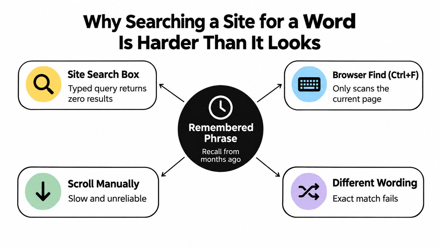
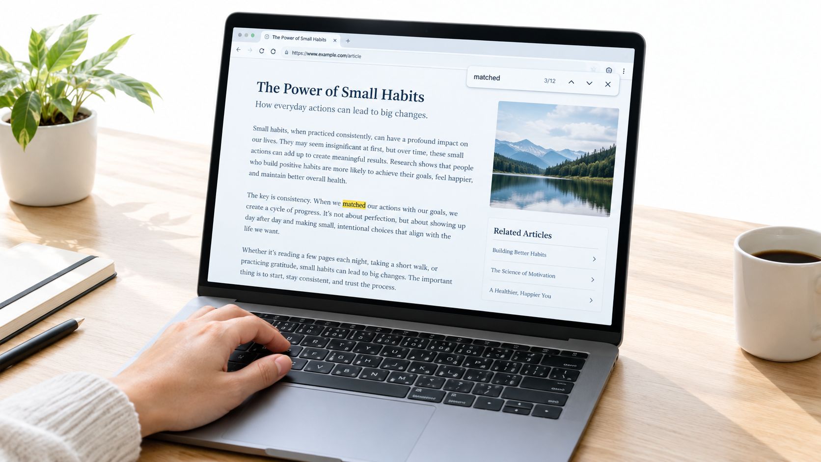
That expectation explains why a search box matters on a content-heavy site. A reader may not remember the article title, but they may remember “sourdough discard,” “budgeting,” or “mobile layout.” Clear site search gives those visitors an alternative to scrolling through archives. If you're unsure how a phrase can be located within a page before planning your own content structure, this guide to locate words on webpages offers a practical reference.

The rest of the system becomes easier to understand once you separate the visitor's action from WordPress's work. The visitor enters a query. WordPress processes it against indexed content. The results page presents matches. Search quality depends on how well those steps fit the visitor's expectation.

How a Site Search Function Works Behind the Scenes

Think of your website as a library that prepares a subject index before anyone walks through the door. WordPress stores information about posts and pages, then uses that stored content when a visitor submits a search. The search function doesn't read every page from scratch in the same way a person would. It sends the query to the site and checks the available records for matching terms.

The four moving parts

Input is the search field where the visitor types a phrase such as “free keyword tools.” The form normally sends that phrase to a search results address through a standard request. A simple form is valuable because it can keep working even when JavaScript is disabled or a theme's interactive features fail.

Query processing takes the submitted words and turns them into a request WordPress can use. In a basic installation, that request checks the searchable post data stored in the WordPress database. WordPress's default search is commonly described as a SQL-style LIKE lookup against the wp_posts table, which means it looks for matching text patterns rather than understanding a visitor's full intention.

Indexing determines which content is available to match. WordPress's built-in search focuses on ordinary post material, including titles, content, and excerpts. A troubleshooting explanation of WordPress search limitations notes that the default system is case-insensitive, but doesn't reliably expand related word forms and doesn't automatically search custom fields, taxonomies, or post meta.

Result delivery is the page the visitor sees after submitting the form. WordPress gathers possible matches, orders them, and displays titles, links, and supporting text. The result is closer to a filing system than to a human editor. It can find repeated words, but it doesn't automatically understand that two different expressions may describe the same idea.

An infographic showing the four steps of how a site search function works behind the scenes.

Why matching isn't the same as understanding

Traditional search ranking can consider where a term appears, how often it appears, and signals such as publication date. A title match may look more useful than a passing mention in the body, but the default system doesn't possess deep semantic understanding. A post about “rainy-day savings” may not appear for “emergency fund” unless the relevant words are present or an extension supplies that relationship.

That distinction becomes important as your archive grows. A lightweight index can be perfectly adequate for a straightforward blog, while a documentation site, recipe site, or product catalog may have useful information stored outside the title and body. If your content needs to connect structured facts with natural-language questions, it can help to study how teams build a working AI knowledge base, while remembering that a small WordPress publisher may not need that complexity yet.

The system also depends on speed. Google reported that adding 100 to 400 milliseconds of delay to search results reduced searches per user by about 0.2% to 0.6% in its research on speed, as described in Google's speed research. For WordPress, that gives a practical reason to keep indexing focused, templates light, and repeated queries efficient. A visitor who receives an unhelpful result slowly experiences two problems instead of one.

Core Features That Shape Search Quality

A useful way to compare search features is to place them in levels. The first level helps the system find ordinary matches. The next level helps visitors narrow and refine those matches. The final level helps you learn what people wanted when the search did or didn't work.

Start with dependable matching

The essential layer is full-text matching across the fields your readers expect. On a basic WordPress blog, that usually means post titles and body content. If your site publishes articles about tools, for example, a visitor searching “free writing tools” should be able to find a relevant post even when the phrase isn't in the title.

Partial-word and fuzzy matching add resilience. A reader may type a misspelled term, use a shortened word, or enter a slightly different form. Without tolerance, one typing error can produce an empty page even though a useful article exists. Relevance ranking then determines which match appears first. Giving stronger weight to a title match than to a single body-text mention generally makes the result list easier to scan.

Add refinement when the archive needs it

Filtering becomes valuable when one query returns several kinds of content. A site might let visitors narrow results by category, tag, or post type. On an archive that includes tutorials, opinion posts, and downloads, a filter can turn a long mixed list into a manageable set.

Autocomplete works earlier in the process. As the visitor types, a small dropdown can suggest common phrases or existing content. It can also help a visitor discover the vocabulary your site uses, which is useful when their first wording doesn't match your headings.

The best feature set depends on the archive, not on how impressive the plugin's settings page looks.

TierFeatureWhat It Changes for Visitors
EssentialTitle and body matchingGives ordinary keyword searches a dependable starting point
EssentialRelevance rankingPlaces stronger matches where visitors are most likely to see them
Quality shapingFuzzy matching and typo toleranceRecovers searches with spelling errors or partial terms
Quality shapingFilters and facetsHelps visitors narrow results by category, tag, or content type
ConvenienceAutocomplete suggestionsOffers useful phrasing before the visitor submits a query
InsightHighlighted terms and analyticsMakes matches easier to scan and reveals recurring content needs

Use the results page as feedback

Highlighted terms in excerpts help visitors see why a result appeared. If the phrase “free map tools” is visible in the excerpt, the reader can judge relevance without opening several pages. Search analytics provide a publisher-side view of the same experience. They can reveal repeated searches, no-result phrases, and topics readers want but cannot find through navigation.

Synonym controls and stop-word settings refine the system further. Synonyms connect terms that mean similar things on your site. Stop-word controls prevent common words from overwhelming the match. These controls need care because an incorrect synonym can make results look broad while reducing their usefulness.

The historical evidence reinforces why refinement matters. A Wiley study recorded 1,025,910 queries from 211,063 users, with 51.8% unique queries, 38.5% repeat queries, and 9.7% zero-query sessions, as reported in the Wiley study of web-search behavior9999:9999%3C::AID-ASI1591%3E3.0.CO;2-R). A Microsoft Research study found that users spent an average of 5.7 seconds considering results before their first selection, with a 95% confidence interval of 4.9 to 6.5 seconds, according to Microsoft's search-results research. A clear first result and a useful refinement path both respect that short decision window.

WordPress Default Search Versus Enhanced Alternatives

WordPress core gives beginners a deliberately minimal search function. It's available without a separate search service, extra indexing process, or plugin dependency. The trade-off is scope. The default system generally searches ordinary post material, while structured information outside that material may remain invisible.

Compare the choice through three dimensions: indexing scope, relevance ranking, and empty-state handling. This is more useful than asking whether one option is “better.”

DimensionWordPress DefaultEnhanced Plugin, such as SearchWP or Relevanssi
Indexing scopePrimarily post titles, content, and excerptsCan extend search to selected custom fields, PDFs, products, and other configured content
RelevanceBasic keyword-oriented matchingCan add weighting, fuzzy matching, and more deliberate ranking controls
Empty-state handlingDepends heavily on the theme's “Nothing Found” templateMay provide suggestions, highlighted terms, filters, or configurable recovery paths
MaintenanceNo additional search plugin to updateRequires indexing management, compatibility checks, and plugin maintenance
Resource demandsLightweight for a simple archiveMore indexing work and potential database or service overhead

Consider a recipe blog with ingredients stored in custom fields. A reader may search for “free budgeting tools” or “free baking tools,” but the important ingredient information may not appear in the post body. An enhanced search system can index that structured information if configured to do so. A support knowledge base may benefit from taxonomy-aware weighting, while a small portfolio may need only an empty-results page that points visitors to project categories.

Plugins such as SearchWP, Relevanssi, and Jetpack Search can extend the areas WordPress searches and add controls for ranking or presentation. The exact behavior depends on the product, its configuration, and whether the content has been indexed correctly. Adding a plugin doesn't automatically create good relevance. Someone still needs to decide which fields matter and test real visitor queries.

The default search is a useful baseline. Replace it only when you can name the content it misses or the visitor behavior it fails to support.

A beginner can first review the site's content structure and empty state. If the archive is small and uses standard posts, the built-in system may be sufficient. If visitors repeatedly search for metadata, attachments, products, or taxonomies, an enhanced alternative becomes easier to justify. Before changing the search, review the broader choices in best WordPress blog layouts so the search placement supports, rather than competes with, the site's navigation.

Implementation Considerations for WordPress Sites

Installing a search widget is only the beginning. A usable implementation combines placement, presentation, performance, and accessibility. Treat those as separate decisions, because a search box can be visible and still be difficult to use.

Put the entry point where visitors look

On desktop, the header is usually a sensible location because visitors can access it from every page. On mobile, the same control may need to live in a menu drawer or a clearly reachable footer area. Don't hide search behind an icon that has no label if your audience may not recognize it.

The field also needs helpful presentation. Placeholder text such as “Search articles” explains the action more clearly than an empty box. A visible submit button can support people who don't use keyboard shortcuts, and a proper label helps screen-reader users understand the field.

Your empty-state page needs equal attention. WordPress may show a “Nothing Found” message when no content matches, but that message shouldn't end the visitor's journey. Explain what the site searches, suggest a broader phrase, and offer links to categories, recent posts, or the homepage.

Keep the index focused

Index published, public content that visitors can open. Excluding drafts, private records, and irrelevant post types prevents the results from promising access to something unavailable. You may also want to exclude repeated boilerplate, shortcode output, or template text that can create misleading matches.

Performance matters even on a lightweight theme. Limit unnecessary searchable fields, cache frequent queries where appropriate, and monitor whether an enhanced index adds database work. A simple site doesn't need an elaborate search architecture, but it does need a search process that doesn't make every result request heavier than necessary.

Preserve access without JavaScript

The input should have a visible label or an appropriate aria-label. Results should be reachable with a keyboard, and focus should move predictably when interactive suggestions appear. The no-JavaScript fallback should still submit a normal GET form and return a results page, so the feature remains useful under different themes, caching layers, and browser settings.

Responsive behavior is part of the same implementation. MDN's responsive design guidance explains why the viewport meta tag belongs in the document head and how width=device-width lets mobile browsers use the device's actual width. MDN's media-query guidance warns that without the viewport setting, a browser may treat the page as roughly 980 pixels wide rather than using the device's actual width. A search field that works on a desktop but becomes tiny or off-screen on a phone isn't complete.

For a broader beginner-friendly foundation, this guide to how to create a WordPress blog can help you consider search alongside themes, content organization, and publishing basics.

A Real Search Session Walk Through an Example

A hobby bakery blog has about 80 posts covering sourdough, cakes, bread storage, and kitchen basics. A visitor arrives on a recipe article, scans the header, and types “sourdough discard recipes” into the search box. The WordPress form submits the phrase, the default query checks the searchable post records, and the results page returns five posts in under a second in this example.

The visitor opens the second result because its title and excerpt mention the exact kind of recipe they want. That first search succeeds because the phrase appears in ordinary post content and the results page gives enough context to compare the matches. The visitor then searches for “newsletter signup” because they want to receive future recipes.

No result appears. The signup page is stored as a draft or uses a non-public post type excluded from the search query, so the system cannot show it. Consequently, the empty-state page decides what happens next. A blank message sends the visitor away, while a useful recovery path gives them another chance to discover the publication.

A person using a laptop to search for sourdough discard recipes on a website.

The bakery owner improves the “Nothing Found” template by adding popular categories, recent posts, and a link to the site's RSS feed. The visitor may not find the signup page through search, but they can still open another recipe, browse the archive, or subscribe through a feed reader. The empty page becomes a discovery surface rather than a dead end.

RSS is useful here because it serves a different habit. Britannica describes RSS as a format for delivering new content from frequently updated websites to subscribers through an RSS reader or aggregator. The RSS Board also describes RSS as an XML-based format for syndicating web content across client software. Search helps someone retrieve an existing article. RSS helps someone track future updates without returning to the homepage manually.

This small journey shows why the site search function shouldn't be judged only by successful queries. The failed query reveals an indexing or expectation problem, while the recovery page determines whether the visitor can continue. Search and feeds support different stages of content discovery, and a simple WordPress site can offer both without turning into a complex application.

Your Site Search Function Checklist and Next Steps

A beginner can improve search without changing everything at once. Use three decision groups, then revisit each group when the site's content or visitor behavior changes.

Placement and visibility

Put the search box in the desktop header or another location visitors can reach from every page. Make it available from the mobile menu, use a clear label, and test it on a phone. Revisit this decision when people report that they couldn't find search or when a theme redesign changes the header.

Functionality and recovery

Search your own site with ordinary phrases, misspellings, category names, and terms that appear only in structured fields. Confirm that results show published content, that ordering feels sensible, and that the “Nothing Found” page offers categories, recent posts, or a broader search suggestion.

You can use these example queries to test different content needs:

  • Free office tools
  • Free tools
  • Free AI tools online
  • Free OCR tools
  • Free editing tools for videos
  • Free tools for video editing
  • Free daemon tools
  • Free zip tools
  • Free pro tools download
  • Pro tools free download
  • Free keyword tools
  • Free keyword tool
  • Free tools like Photoshop
  • Free budgeting tools
  • Free humanizer tools
  • Free tools online
  • Free wireframe tools
  • Free BI tools
  • Free visualization tools
  • Free writing tools
  • Free drawing tools
  • Free CRM tools
  • Free map tools

These phrases also show why exact-word matching can be restrictive. A visitor may use singular and plural forms, add “online,” or search for a product phrase that your article expresses differently. Revisit the default search when these tests repeatedly return empty or poorly ordered results.

Growth and optimization

Start with WordPress's built-in search if your site uses standard posts and the results meet your readers' needs. Consider SearchWP, Relevanssi, Jetpack Search, or another suitable extension when you can identify a specific gap, such as custom fields, PDFs, taxonomies, product data, fuzzy matching, or better analytics.

Keep a record of no-result searches and recurring reformulations. Revisit your categories and tags when visitors use terms that your site doesn't use, and consider an enhanced search system when the archive becomes harder to browse manually.

For more WordPress publishing guidance, explore the Read More Info blog and apply one improvement at a time. A visible search box, honest indexing scope, useful empty-state guidance, and a lightweight results page are enough to create a strong foundation before you consider advanced features.


Read More Info offers practical WordPress articles and updates for readers who want straightforward guidance on publishing, discovery, and site management. Visit Read More Info to find more advice for building and improving a clear, useful content website.

10 Responsive Template for Website Picks

A mobile-friendly demo can still be a poor foundation for a real publication. A polished homepage says little about how a theme handles long articles, category archives, search results, empty states, RSS-friendly publishing, image sizing, or future maintenance. It also says little about whether editors can work comfortably in the block editor or whether every meaningful change depends on a page builder.

That distinction matters for a lean WordPress publication such as Read More Info. WordPress provides site-wide feeds at /feed/ and comments feeds at /comments/feed/, while archive, search, category, author, and other content feeds can also be exposed through standard feed URLs, as documented by WordPress feed documentation and WordPress.com feed guidance. A responsive template for website use must preserve those publishing paths, not just resize a hero section.

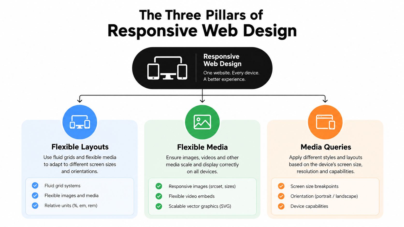
This list compares ten options by editing model, customization depth, likely overhead, responsive controls, portability, limitations, and real implementation checks. Responsive design is now a near-universal baseline, with an industry summary placing adoption at around 90% of websites worldwide, or roughly 1.2 billion websites, in the 2025-2026 period reported industry summary. The better question is which foundation remains readable, fast, accessible, and manageable after launch. That same principle applies to mobile-first design for law firms, where clear content access matters more than visual novelty.

Table of Contents

1. Astra by Brainstorm Force

Astra by Brainstorm Force

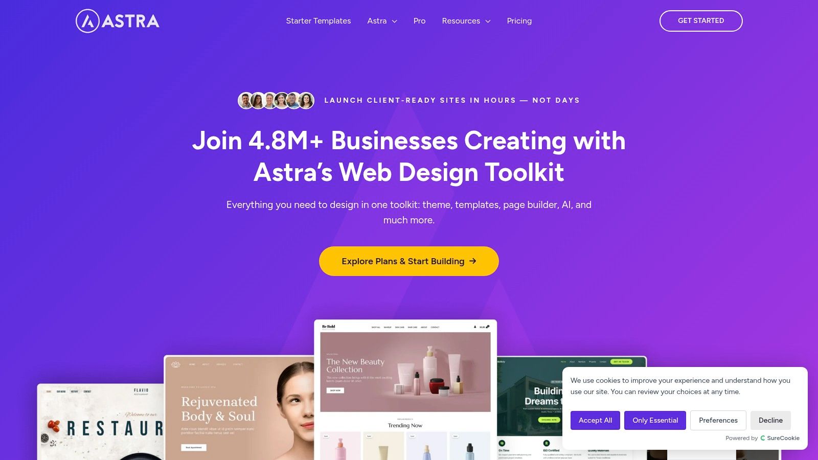
Astra is a strong general-purpose choice when a publication needs a clean blog today and more flexible landing pages later. Its performance-first approach keeps the theme from dictating every visual decision, while layout, typography, color, container, and sidebar controls give editors enough room to shape a recognizable publication.

The practical advantage is compatibility. Astra works with Gutenberg, Elementor, Spectra blocks, and a broad starter-site library, so a site can begin with the block editor and add more specialized layouts without immediately rebuilding its foundation. Header and footer builders, blog layout controls, and granular width settings are useful when the homepage, archives, and individual posts need different levels of density.

For Read More Info, I'd start with a restrained blog layout, then test the Read More Info blog on narrow screens before importing decorative elements. The theme can support a straightforward reading experience, but its large settings surface can invite unnecessary customization.

Where Astra works well

  • Lean publishing: It can produce a clean article-first layout without forcing a visual builder.
  • Future expansion: Landing pages, portfolios, or commercial sections can be added without abandoning the theme.
  • Responsive control: Container widths, sidebars, headers, and typography can be tuned rather than accepted as fixed defaults.

The trade-off is that many power-user controls sit behind the Pro addon, and the breadth of settings can slow down beginners. Keep the design system small, avoid stacking starter templates with extra plugins, and verify that search, archive, and “Nothing Found” states remain coherent.

2. GeneratePress

GeneratePress is the option I'd choose when predictable markup and low overhead matter more than visual spectacle. It starts almost bare, which can feel underwhelming in a demo, but that restraint becomes valuable on a content site where the article, navigation, and archive structure should carry the experience.

Its close relationship with GenerateBlocks makes it especially suitable for block-editor workflows. Editors can build reusable sections with core WordPress concepts instead of locking every page into a proprietary builder canvas. GeneratePress Premium adds the theme builder, advanced typography, and starter sites, while the free foundation remains useful for a lean publication.

A new site may need deliberate configuration before it looks distinctive. That isn't a flaw, but it changes the work involved. You'll need to establish container widths, heading scale, post metadata, archive spacing, and navigation behavior rather than relying on a highly art-directed import.

Best use in a publishing workflow

GeneratePress suits writers, editors, and small teams that value stable templates over endless visual options. It's a particularly sensible base for a WordPress blog creation workflow because the editor can focus on posts while the theme supplies a controlled structure.

Its accessibility-oriented approach and attention to Core Web Vitals are useful starting points, but no theme can guarantee a fast result after images, analytics, advertising, and embeds are added. Test the actual homepage and post template, not an empty installation.

Practical rule: If a design requires a builder for every paragraph, it probably isn't lean enough for a publication whose main product is readable text.

The limitation is customization depth without paid modules or GenerateBlocks. That cost can be worthwhile when it replaces a heavier builder stack, but beginners should expect a setup phase rather than instant visual polish.

3. Kadence Theme by Kadence and Nexcess

Kadence Theme by Kadence and Nexcess

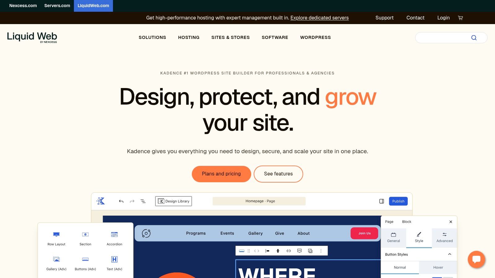
Kadence takes a blocks-first approach but feels more designed out of the box than GeneratePress. Its typography, spacing, and starter templates can get a small business or content publication to a professional appearance quickly, which reduces the temptation to assemble a page builder and several visual add-ons.

The header, footer, and mega-menu builders provide meaningful control over site-wide navigation. Global design settings help keep headings, buttons, and content sections consistent, while dynamic content sources and optional integrations support a site that may later add WooCommerce, memberships, popups, or testing tools.

That growth path is also the main consideration. The current Kadence offering is consolidated under Liquid Web and Nexcess, with bundle structures that connect additional marketing, membership, and security tools to annual plans. Those options can be useful for an all-in-one stack, but a simple blog may pay for breadth it won't use.

What to test before committing

Install only the modules required for the publication. Then inspect:

  • Header collapse: Confirm that the mobile menu remains obvious and usable.
  • Archive density: Check whether post cards preserve clear titles and excerpts without excessive decoration.
  • Editor output: Publish a real article containing headings, lists, images, links, and embeds.
  • Growth features: Decide whether optional commerce or conversion tools belong in the theme layer at all.

Kadence is a good fit when polished visual setup and future business functionality outweigh the simplicity of a minimal theme. It can feel heavier than an ultra-lean foundation if every module is enabled, so treat its optional ecosystem as a menu, not a requirement.

4. Neve by Themeisle

Neve is built for quick, flexible WordPress launches. Its blog and magazine-friendly templates make it easier to move from an empty installation to an attractive publication, while Gutenberg support keeps the editing model accessible to teams that don't want every page to depend on Elementor.

The theme offers multiple blog layouts, archive controls, and starter sites for both the block editor and Elementor. That flexibility is useful for a small business owner who may publish articles now and add a course, store, or service section later. It also creates a decision point: choose the editor you want to maintain before importing a design that assumes another one.

Neve's performance module is relevant because responsive behavior alone doesn't guarantee a good mobile experience. WordPress accessibility guidance describes responsive design as automatic adjustment across phones, tablets, and desktop computers, and recommends testing themes across browsers and screen widths. Neve should be tested the same way, with real content rather than placeholder blocks.

The maintenance trade-off

Neve is attractive for beginners because it reduces the time needed to establish typography, spacing, and page hierarchy. Some of the strongest layout controls and templates are Pro-only, while displayed promotional prices may renew at the full rate. Treat that commercial structure as part of the technical decision, not as a separate purchasing detail.

It's a practical choice for a site that needs visual momentum without committing to a highly specialized builder. Keep the template light, limit add-ons, and verify that the post, category, search, and empty states all use the same visual language. A responsive template for website use should make those less glamorous screens feel intentional too.

5. Blocksy by CreativeThemes

Blocksy by CreativeThemes

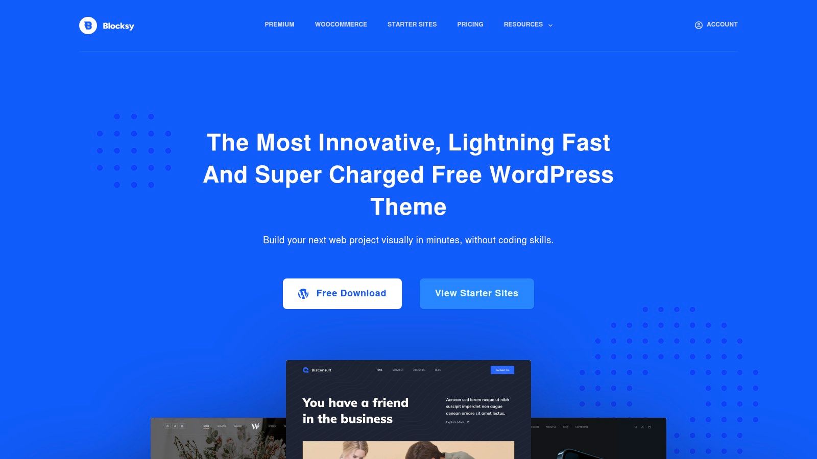
Blocksy balances a feature-rich free version with a modern Customizer experience. It's a strong candidate when a publication needs more than typography and spacing, but the team still wants to work primarily with Gutenberg instead of building every template in a visual editor.

Its header and footer builder, content hooks, and blog enhancements give editors control over the parts readers use. Related and trending posts, reading-time displays, dark mode, and flexible content areas can improve discovery when they're applied carefully. WooCommerce extensions, including filters and floating-cart options, make Blocksy more adaptable if the site grows into commerce.

The free version is unusually capable, but that doesn't mean every option belongs on a lean publication. More controls create more ways to produce inconsistent templates. A related-post module can help an archive, for example, but it can also push the primary article below the fold if spacing and image sizes aren't managed.

A useful balance for growing sites

Blocksy suits creators who want a clear interface and room to experiment. Its UI is friendlier than many multipurpose themes, and the theme is maintained with speed in mind. Pro-only add-ons still create boundaries, especially around advanced site-wide features and white-label workflows.

Use a real content sample before finalizing the design. Test a short post, a long post, an image-heavy post, and a search result with no matches. Make sure touch targets remain easy to use, headings wrap naturally, and dark mode doesn't reduce contrast.

The best use of Blocksy is selective customization. Enable the tools that improve navigation or reading, then leave the rest off. That approach preserves the theme's flexibility without turning a simple publication into a collection of competing modules.

6. OceanWP

OceanWP

OceanWP remains a useful choice for people who want fine-grained Customizer control without writing code. It has long supported multipurpose sites, and its extensive controls cover blog archives, single posts, search pages, 404 pages, headers, footers, and many individual page elements.

That breadth helps when a publication has unusual requirements. You can shape the post metadata, sidebar behavior, featured images, and archive structure with more precision than a minimal theme typically provides. Ocean Extra adds functionality, while the demo and extension ecosystem gives Elementor users a fast route to a traditional blog layout.

The risk is configuration sprawl. A site can accumulate extensions because each one solves a narrow visual problem, then lose the performance and maintenance advantages that made a theme attractive in the first place.

Responsive isn't the same as usable. A page can shrink correctly while its menu, form controls, images, and search state remain frustrating on a phone.

OceanWP is best for teams willing to make deliberate decisions about which extensions are active. Review the plugin list after the initial setup, remove demo content and unused components, and inspect the generated page at phone and desktop widths. Check horizontal scrolling, keyboard focus, image cropping, and the behavior of the 404 and no-results pages.

Pricing and plan details are distributed across documentation and checkout, so record the license assumptions before building a site that depends on premium extensions. OceanWP gives you control, but the operator must supply discipline.

7. Hello by Elementor

Hello is not a traditional content theme. It's an ultra-minimal blank canvas designed to hand almost all presentation work to Elementor. That makes it predictable for a custom build, especially when a designer wants the theme to add as little styling and markup as possible.

The free theme is available through the WordPress repository and has a tiny footprint. Elementor's Theme Builder then supplies templates for headers, footers, archives, posts, search results, and other site-wide structures. This separation can be clean when one person owns the design system and understands the builder.

It's less comfortable for a beginner who expects a complete blog experience immediately. Without Elementor templates or add-ons, Hello offers fewer blog-specific conveniences than Astra, GeneratePress, or Twenty Twenty-Four. The apparent simplicity also hides a dependency: if the site's layout, archive logic, and content presentation live inside Elementor, switching away later requires real reconstruction.

Choose Hello for a builder-led operation

Hello works when the team has a reason to standardize on Elementor. It can support a highly customized portfolio, service site, or publication with a branded editorial shell, but it isn't the obvious choice for a minimal WordPress blog that should remain close to core functionality.

Audit mobile settings at the widget and template level. Elementor gives responsive controls, but editors can create inconsistent breakpoints, oversized sections, and decorative elements that make articles harder to read. Keep article templates simpler than marketing pages, and make sure core WordPress search, feeds, navigation, and empty states still have deliberate designs.

The theme itself is light. The finished website may not be, because the builder, widgets, animations, fonts, and third-party integrations determine the final payload.

8. Divi by Elegant Themes

Divi by Elegant Themes

Divi is a theme and visual builder ecosystem rather than a narrowly focused blog foundation. Its appeal is consistency. The Visual Builder, Theme Builder, layout packs, Divi AI options, and marketplace give a team one visual environment for creating branded pages, reusable sections, and promotional layouts.

That can accelerate design iteration for a creator who thinks visually. Divi Quick Sites and imported layout packs reduce the amount of blank-canvas work, while cloud storage for layouts and products such as Bloom and Monarch extend the ecosystem beyond page design. An unlimited-site license can also make sense for agencies or operators managing several properties.

The cost is structural dependence. Divi is heavier than minimalist themes, and the smoothest workflow assumes that the site remains inside the Divi ecosystem. Editors who only need to publish standard articles may find the visual layer more elaborate than necessary.

Where the builder earns its place

Divi is suitable when landing pages, conversion sections, email capture, and brand consistency matter as much as the archive. For a publication, keep the editorial template restrained and reserve advanced modules for the homepage or campaign pages. A long article shouldn't inherit the visual complexity of a sales page.

Test migration assumptions before launch. Export a layout, examine how content behaves outside the builder, and confirm that editors can publish without touching design settings. The builder's learning curve is manageable for a dedicated team, but it adds process and training requirements for occasional contributors.

Divi is a capable integrated system. It's not the best answer merely because its demo looks responsive.

9. Avada by ThemeFusion

Avada is a mature website builder built around its own visual tools. It offers live editing, layout, header and footer, mega-menu, and form builders, along with a large element library and importable demos. For a small business owner who wants a complete site assembled quickly, that breadth is the central attraction.

The theme supports a buy-once-per-site model with lifetime updates for each site license. Its performance wizard gives the operator controls for reducing unnecessary features, but the imported demo still needs review. Large demos can bring extra images, scripts, widgets, and layout components that a focused publication doesn't need.

Avada works best when a team wants a defined visual system instead of a loose collection of plugins. The documentation and long market history reduce the risk of adopting an abandoned tool, while the demo library can help non-technical owners reach a credible starting point.

Import less than you think you need

Start with the smallest relevant demo, then remove unused pages and elements before adding content. Check the homepage, archive, single post, search, 404, and “Nothing Found” screens on real devices. Don't assume the performance wizard fixes every issue created by oversized images, animations, or third-party scripts.

The one-site license also matters. Agencies or owners planning several sites must account for the single-use license model rather than treating the theme as a universal asset.

Avada is a reasonable choice when the integrated builder and mature documentation justify additional weight. It's a poor fit when the publication's needs are primarily semantic HTML, straightforward posts, open feeds, and minimal administration.

10. Twenty Twenty-Four

Twenty Twenty-Four

Twenty Twenty-Four is the standards-first option in this list. As the official default theme for WordPress 6.4, it was built for Full Site Editing, with the Site Editor, global styles, patterns, page templates, and core blocks forming the entire design model.

That matters for portability. The site doesn't need a commercial builder to create its basic structure, and editors work inside the WordPress editing system rather than a separate visual language. The theme is free and maintained by WordPress.org, which makes it a sensible baseline for a content-first publication that values fewer vendor dependencies.

It won't provide the same library of turn-key demos as commercial themes. Customization depends on learning Full Site Editing, including template parts, styles, patterns, navigation, and block settings. That learning curve is real, but so is the benefit of understanding the system that stores and renders the site.

For a publication such as Read More Info, start by studying WordPress blog layouts for content sites and then build only the patterns the editorial workflow needs. Keep the homepage, post template, archive, search, and empty state consistent rather than adding decorative sections just because the editor makes them possible.

Why it's a strong long-term baseline

Twenty Twenty-Four works entirely with core blocks and is responsive and accessible by default according to its positioning as a WordPress default theme. Still, test the final site. Accessibility and responsive behavior can be weakened by custom blocks, poor color choices, oversized media, or incompatible plugins.

WordPress recommends testing themes in different browsers and screen widths, and that should include keyboard navigation, zoom, rotation, touch interaction, and screen-reader landmarks. A theme that preserves readable content without a builder lock-in is often easier to maintain than a more impressive demo.

Top 10 Responsive WordPress Theme Comparison

ThemeCore featuresUX & Performance (★)Price / Value (💰)Best for (👥)Standout (✨ / 🏆)
Astra (Brainstorm Force)Performance-first, header/footer builder, large starter library, Gutenberg/Elementor★★★★, Fast, clean reading💰💰 Free core; Pro addon👥 Bloggers & sites planning expansion✨Large starter library; 🏆Big community & docs
GeneratePressMinimal, GP Premium theme builder, GenerateBlocks integration★★★★★, Extremely fast, CWW-friendly💰💰 Free core; Premium for builder👥 Performance-focused blogs & developers✨Tight block integration; 🏆Proven stability
Kadence Theme (Nexcess)Blocks-first, global controls, 200+ templates, dynamic add-ons★★★★, Polished typography, pro-ready💰💰💰 Freemium; bundles under annual plans👥 Growing sites, membership/commerce✨All-in-one growth tooling; 🏆Quick professional look
Neve (Themeisle)Multiple blog layouts, 110+ starters, performance module★★★★, Mobile-first, attractive templates💰💰 Freemium; Pro templates/cloud👥 Bloggers & magazines wanting quick setup✨Many starters; good WooCommerce/LMS support
Blocksy (CreativeThemes)Customizer-driven, header/footer builder, blog extras, WooCommerce★★★★, Fast, user-friendly UI💰💰 Feature-rich free; Pro add-ons👥 Non-technical users wanting flexibility✨Feature-rich free tier; 🏆Clear UI
OceanWPExtensive Customizer controls, demos, Ocean Extra plugin★★★, Very configurable; can bloat💰💰 Freemium; Pro bundles👥 Elementor users & highly configurable blogs✨Fine-grained control; large demo library
Hello (Elementor)Ultra-minimal blank canvas, tiny footprint, Elementor Theme Builder★★★, Extremely lightweight; minimal niceties💰 Free👥 Elementor-driven custom designs✨Zero-cost canvas for Elementor
Divi (Elegant Themes)Visual Builder, 300+ packs, Divi AI, unlimited sites/license★★★★, Powerful visual editing; heavier💰💰💰 Premium (annual/lifetime)👥 Designers/agencies needing visual tools✨Huge asset ecosystem; 🏆Integrated visual builder
Avada (ThemeFusion)Live Visual Builder, 110+ demos, many elements, lifetime updates★★★, Mature, demo-heavy if overused💰💰 One-time per-site ThemeForest license👥 Users wanting many demo starters & buy-once✨Massive demo library; lifetime updates
Twenty Twenty-Four (WP default)Full Site Editing, global styles, core blocks, responsive★★★★, Standards-first, accessible💰 Free (WordPress.org)👥 Content-first blogs avoiding vendor lock-in✨Core-driven FSE; 🏆Official WordPress theme

Choose the Foundation You Can Maintain

There isn't one universal winner. The right responsive template for website use depends on who will edit the site, how much design control the publication needs, and whether the team can maintain the resulting builder and plugin stack.

Choose Twenty Twenty-Four or GeneratePress for a standards-first, lean publication. Twenty Twenty-Four keeps the site close to WordPress core and Full Site Editing, while GeneratePress offers a more configurable performance-focused foundation for teams comfortable adding GenerateBlocks or premium controls. Both choices make sense when readable articles, predictable archives, semantic structure, and low maintenance matter more than a large demo library.

Choose Astra, Neve, or Blocksy when you want a faster visual setup with room to grow. Astra is broadly compatible and adaptable, Neve gets an attractive blog online quickly, and Blocksy provides a particularly capable interface for creators who want richer blog and commerce options. In each case, enable only the modules that support the publication's actual workflow.

Choose Hello when Elementor is already the operating model. It's a clean base for a custom builder-led site, but it isn't a complete editorial experience by itself. Choose Divi or Avada when an integrated builder ecosystem is worth the additional weight, training, licensing, and migration considerations.

Before importing a full demo, install one candidate on a test site. Review the homepage, archive, post, search, and empty-state behavior at phone and desktop widths. Then verify:

  • RSS links: Confirm the site-wide feed and comments feed remain available and discoverable. WordPress documents both /feed/ and /comments/feed/ as standard endpoints in its feed guidance.
  • Typography: Check line length, heading wrapping, link visibility, and readability when the browser is zoomed.
  • Navigation: Test keyboard focus, touch targets, menu collapse, and the path back to the archive.
  • Image sizing: Publish different image dimensions and confirm that small screens don't download or display unnecessarily oversized media.
  • Performance: Audit the actual templates after adding fonts, analytics, embeds, plugins, and editorial images.
  • Portability: Determine which content remains usable if the theme or builder is removed.

Responsive design has moved from an optional enhancement to a baseline expectation. Earlier responsive design theory centered on fluid grids, flexible images, and media queries in Ethan Marcotte's influential 2010 article, while a later dataset reported responsive techniques on 62.5% of websites worldwide in 2023, media queries on 94% of the top 1,000 websites, and adoption on 81% of Fortune 500 websites that year dataset summary. The figures explain the standard's reach, but they don't choose a theme for you.

The practical quality bar is higher than visual resizing. Guidance on responsive accessibility emphasizes preventing horizontal scrolling, preserving legible text, supporting keyboard and touch navigation, and avoiding fixed-width elements responsive accessibility guidance. Mobile performance matters too. One UX summary reports that 53% of mobile visitors leave a page when it takes longer than three seconds to load, while 74% are more likely to return to a mobile-friendly site, 67% are more likely to buy from one, and 52% say a poor mobile experience makes them less likely to engage with a company UX statistics summary. Those figures are benchmarks, not guarantees, so test your own site rather than borrowing confidence from a demo.

The best responsive template for website use is the one that keeps articles readable, archives discoverable, feeds accessible, and maintenance manageable after launch. Pick the foundation your team can still understand when the first redesign, plugin conflict, or content spike arrives.


Read More Info publishes straightforward WordPress articles for general readers, with responsive reading, on-site search, and open RSS feeds for site updates and comments. Visit Read More Info to see a lean content publication in practice and use it as a reference while evaluating your own responsive template.

10 Feed Reader Firefox Options Compared

Most advice about a feed reader Firefox setup starts with the extension list. That's backwards. The right choice depends on whether you want browser-local storage, synchronized access across devices, aggressive filtering, bookmark-style browsing, or a reader you can own and maintain yourself. The practical comparison is setup friction, feed discovery, full-text handling, refresh behavior, privacy, exportability, and how much maintenance you're willing to carry.

Read More Info gives a useful test case for any feed reader Firefox workflow because it exposes both a site feed and a comments feed, so you can compare article updates and discussion updates side by side. Test with the main Read More Info feed and the comments feed. If you want a quick broader benchmark for reader selection, the smart RSS reader picks roundup can help frame the trade-offs before you install anything.

Table of Contents

1. Feedbro

Feedbro is the strongest choice if you want a full reader living inside Firefox instead of a separate service. Its page detection, standalone RSS, Atom, and RDF handling, plus a rule engine for filtering, tagging, and notifications, make it feel closer to a local workflow hub than a simple subscription list. The trade-off is obvious, your data follows the browser profile, not a cloud account.

Feedbro

Feedbro's built-in full-text conversion matters when feeds are truncated. If a publisher only exposes summaries, the extension can often reconstruct enough readable content to keep you from jumping back to the site. That's useful in real reading sessions because it keeps the workflow inside Firefox, especially when you're skimming many sources at once.

Practical rule: choose Feedbro when you care more about control than portability. Export and backups become part of the job, because the data is local and tied to the Firefox profile.

Why it works well

  • No separate account: you can subscribe and read without signing into another service.
  • Offline-friendly after fetch: once articles are pulled in, you can keep reading without depending on a live connection.
  • Useful for power users: the filtering and notification rules are far more capable than the average browser add-on.

Where it falls short

  • Profile dependence: if you move browsers or profiles, you need to manage exports.
  • Update delays can happen: add-ons still live under store review cycles, so fixes and improvements don't always land instantly.

For teams or solo readers who like local ownership and don't mind a bit of housekeeping, Feedbro is one of the clearest fits. The Read More Info blog is a good place to test how it handles a normal WordPress feed and a comment stream in the same browser.

2. Feeder

Feeder is the polished option when the feed reader Firefox experience needs to sync cleanly across devices. The browser extension is only part of the product, because the true value is in the web and mobile apps that keep unread items, dashboards, and notifications aligned. That matters if you switch from desktop reading to phone reading without wanting to reconfigure everything.

Feeder

The platform's plan structure is a major decision factor. Feeder publishes a clear pricing grid, and the free plan has limits on feed count and update speed, while faster polling and heavier usage sit on paid tiers. That makes it easier to evaluate than vague freemium products, but it also means the free experience is intentionally bounded.

A better way to think about Feeder is as a synchronized reading system, not just a Firefox add-on. You get unread counters, quick-post lists, rules, and email summaries, which is useful if you treat feeds as a daily queue instead of an archive you occasionally browse. For people who rely on regular checks rather than deep local curation, that workflow is smooth.

Best fit

  • Cross-device readers: if you expect the same subscriptions on desktop and mobile.
  • Notification-driven monitoring: if feed updates need to reach you outside the browser.
  • Users who want transparency: the feature grid makes plan boundaries easy to understand.

Less ideal

  • Free-tier constraints: capped feed counts and slower refresh can get in the way as your list grows.
  • Less ownership than local tools: your reading experience lives inside a service rather than your own browser data.

If your priority is convenience and sync, Feeder is easier to live with than a local-only extension. If your priority is data custody, it's not the first pick.

3. Smart RSS Reader

Smart RSS Reader is the minimalist answer for people who want a lightweight feed reader Firefox setup without a cloud layer. It runs in a single tab, keeps the interface simple, and leans on local storage with OPML import and export. That makes it feel closer to a quiet utility than a platform.

Smart RSS Reader

The main advantage is speed through restraint. You open it, load feeds, and read. There's no heavy dashboard to learn, and that simplicity matters when you only want a local inbox for articles and don't need automation, sharing layers, or a team workspace.

It's the kind of reader that works best when you want the browser to stay a browser.

There's a real ownership angle here too. Because it stores feeds locally and supports OPML, you can move subscriptions in and out without building your workflow around a vendor account. That's attractive for readers who like to keep things portable but don't want to run a server.

Good reasons to use it

  • Simple local use: low friction and easy to understand.
  • No account required: fewer moving parts and fewer privacy trade-offs.
  • OPML support: subscription portability stays practical.

Main limitations

  • No cloud sync out of the box: device-to-device continuity is up to you.
  • Limited future development flags: that means you should treat it as a simple utility, not a long-term platform bet.

If you want the least complicated Firefox-native reader that still respects exportability, Smart RSS Reader is a smart stop. It also fits the standard blog syndication workflow cleanly, which makes it easy to test against ordinary WordPress feeds before committing to something bigger. For a basic publishing reference point, see this guide to blog syndication.

4. Livemarks

Livemarks is for people who never really liked dedicated readers in the first place. It restores the old bookmark-folder style of feed reading, so subscriptions appear where Firefox users already expect to find site collections. That makes it less of a new app and more of a familiar browsing pattern.

Livemarks

This model has a real advantage when your feeds are mostly a handful of sites you check often. You don't need a separate reading pane, a tagging system, or a notification engine if you mainly want bookmark-style folders that update. It also works naturally with any site that exposes a feed, including WordPress sites.

The trade-off is feature depth. Livemarks is lightweight by design, but that also means it stops short of the richer reader behaviors many power users expect. There's no serious rule system, no full-text extraction layer, and no offline cache to help with longer sessions away from the site.

Use it when

  • You prefer bookmarks to dashboards: feed reading becomes part of browsing, not a separate task.
  • You want almost no setup: it's straightforward to understand immediately.
  • You only need basic refresh behavior: not every subscription list needs automation.

Skip it when

  • You want advanced filtering: it won't replace a dedicated reader.
  • You need strong offline reading: it's not built for deep local caching.

Livemarks is a good fit for low-maintenance readers and for people who miss browser-native syndication. It doesn't try to be the best reader, it tries to be the least intrusive one.

5. Inoreader

Inoreader is the heavy-duty choice for readers who want automation, discovery, and content handling in the same place. It does more than aggregate feeds, because it can prioritize items through filters, rules, and full-content loading, while also supporting newsletter-to-RSS and Google News alert workflows. That mix makes it useful for people who read at scale.

Inoreader

The strongest part of Inoreader is how much it can absorb before your reading process breaks. If you're following many sources, need one place for newsletters, or want rules that sort by topic and source behavior, it gives you enough controls to build a real intake system. That's especially useful if your feed reader is also part of your research or monitoring stack.

Its weakness is the same thing that makes it powerful. A lot of the advanced capability lives behind paid plans, and the free tier is intentionally narrower. That doesn't make the product weak, but it does mean the best version of Inoreader is a subscription decision, not just a browser install.

Use it when your priorities are:

  • Automation: rules, filters, and content handling matter more than minimalism.
  • Cross-platform access: you want the same workflow on desktop and mobile.
  • Import/export discipline: you need a reader that can move subscriptions cleanly.

The extra value shows up when you read large volumes and want less manual triage. If your workflow is mostly simple subscription reading, Inoreader can feel heavier than necessary. But if you want the reader to do more of the sorting for you, it earns its place quickly. For WordPress publishers who care about presentation and syndication alongside reader behavior, the Read More Info WordPress layout guide gives a useful publishing-side companion.

6. Feedly

Feedly is the better fit when you want a hosted reader that stays out of the way until you need more control. It is easy to set up, works across devices, and adds keyword tracking and integrations without forcing a local extension workflow.

Feedly

That makes it useful for people who want one place for routine reading and a path to more advanced filtering later. The trade-off is ownership. Your reading setup lives in Feedly's cloud, so it is less private and less self-directed than a Firefox-only add-on or a self-hosted aggregator.

Feedly also scales better than many simple readers. Individual users can keep it lightweight, while teams can use the higher tiers for faster polling, power search, and AI-assisted curation. Those features matter if you read at volume or need shared workflows. If you only want a browser-side subscription list, they can feel like overhead.

Decision point: choose Feedly if you want convenience, sync, and a managed platform. Choose a local extension if you want the reader to stay inside Firefox.

What it does well:

  • Clean onboarding: it is quick to start using.
  • Cross-platform reading: desktop and mobile stay aligned.
  • Team and integration support: useful when the reader sits inside a wider workflow.

What it asks in return:

  • Plan awareness: the better features sit higher in the pricing tiers.
  • Less local control: your subscriptions and reading history live in the cloud rather than in Firefox.
  • Publishing-side context: if you want to think about syndication and layout together, the Read More Info guide to WordPress blog layouts is a useful companion.

Feedly fits readers who want polish and reach more than tinkering and local storage. Test it against the Read More Info comments feed first. If the AI curation tiers are the part you need, the upgrade decision will be clear.

7. NewsBlur

NewsBlur is the flexible reader for people who want a little more control over what surfaces first. Its Intelligence system learns from author, tag, and title signals, so you can train the reader toward the content that matters most. That makes it particularly good for readers with mixed interests and noisy subscription lists.

The hosted product is only part of the story. NewsBlur also offers an open-source server you can self-host, which gives technically inclined users a real ownership path. That matters because the same product can serve both a convenience reader and a personal infrastructure project.

There's also a broader reading angle here. NewsBlur can follow web pages even when a feed isn't available, which helps when sites don't expose clean RSS endpoints. That widens the range of pages you can keep under one roof, although some advanced capabilities sit behind premium pricing.

Why people choose it

  • Training-based prioritization: useful when one list has many different subjects.
  • Hosted or self-hosted: you can choose convenience or control.
  • Web-page following: helpful when a site doesn't publish a usable feed.

Why people pass

  • Premium boundaries: some features are gated.
  • Less immediate than minimalist tools: the learning layer adds complexity.

NewsBlur makes the most sense for readers who are willing to teach the system what matters. If you want a browser-native, no-frills reader, this isn't the simplest path. If you want a reader that adapts to your habits, it's one of the more interesting options.

8. BazQux Reader

BazQux Reader is the fast, no-nonsense choice for people who care more about reading than about visual flourish. It's a web reader with strong full-text extraction, good keyboard navigation, and smart filtering. The interface feels tuned for solo use, especially if you read a lot and want less friction per item.

The product's value comes through in the details. Full-text conversion helps with partial feeds, keyboard shortcuts keep navigation quick, and its comment support on some sites adds a useful layer for readers who follow discussion as well as posts. That makes it especially appealing if your feed habits are more analytical than social.

BazQux also keeps the business model simple. There's a trial, then it's paid. That can be a drawback if you want a perpetual free tier, but it also means the product doesn't try to hide its boundaries. For some buyers, that's easier to trust than a complicated freemium ladder.

BazQux feels like a tool built by people who actually read feeds every day, not by people trying to attach feed reading to a bigger platform pitch.

Strong points:

  • Fast interface: good for high-volume reading sessions.
  • Good typography and shortcuts: the reading experience stays efficient.
  • Transparent paid model: you know what you're paying for.

Weak points:

  • No permanent free plan: it's a paid product after the trial.
  • Smaller service footprint: it's not trying to be an all-purpose suite.

Use BazQux when you want a responsive reader that stays out of your way. It's a good fit for individual users who value speed and clarity over ecosystem depth.

9. Miniflux

Miniflux is the cleanest answer if privacy and ownership are the main decision factors. It's self-hostable, has an official hosted option, and keeps the interface deliberately sparse. The design is opinionated in a useful way, because it avoids the clutter that turns reading into administration.

Miniflux

That simplicity is not a lack of features, it's a choice about what belongs in a reader. Miniflux supports standard APIs for third-party apps, so it can act as a backend for a broader reading setup if you want to keep your interface options open. That's a strong pattern for people who like minimal web UIs but still want mobile or alternate clients.

The hosted plan is attractive for readers who want ownership without server administration. The self-hosted route is better if you want full control, but it does add maintenance work and the responsibility to keep the service running. That's a worthwhile trade if data custody matters to you, but it's not free in operational terms.

What stands out

  • Privacy-first design: minimal tracking and a restrained interface.
  • Hosted or self-hosted: choose based on maintenance tolerance.
  • API support: useful if you want multiple clients around the same backend.

What to expect

  • Less visual polish than big cloud readers: the interface is built for utility.
  • Some speed and refresh trade-offs on hosted use: if you need more control, self-hosting may be the better path.

Miniflux is one of the best choices when you want a reader that behaves like infrastructure, not a productized social app. It rewards people who know exactly what they want.

10. FreshRSS

FreshRSS is the most obvious pick when self-hosting is part of the plan. It's open source, multi-user, extensible, and built to run on modest hosting, which makes it practical for readers who want control without needing a heavy server stack. It also supports OPML import and export, so migration stays manageable.

The standout feature is flexibility. FreshRSS can use WebSub push and can scrape JSON or HTML through XPath for sites without clean feeds. That makes it useful in cases where a publisher's syndication is incomplete or inconsistent, and it broadens the number of sources you can keep under one umbrella.

Its biggest trade-off is also clear. You own the setup, the updates, and the upkeep. If that sounds like work, because it is. But for people who want data control, community-driven software, and a reader that can live on their own server, that work is the point.

Where FreshRSS fits

  • Control over data: the service is yours.
  • Flexible ingestion: feeds, push, and scraping can coexist.
  • Light hosting requirements: it can run on modest infrastructure.

Where it costs you

  • Setup and maintenance: you're responsible for the system.
  • No official hosted tier: third-party hosting is outside the core project.

FreshRSS is the best match for readers who think in terms of infrastructure, not just apps. If you want your reader to be part of your own stack, it's hard to beat.

Top 10 Firefox Feed Readers, Feature Comparison

ReaderKey features ✨UX / Quality ★Price / Value 💰Target audience 👥USP / Notes 🏆
FeedbroStandalone in‑Firefox reader; rule engine; full‑text; offline★★★★💰 Free (local storage)👥 Firefox users wanting local/offline🏆 Powerful rule engine; no cloud account
FeederExtension + web/mobile; rules, dashboards; faster polling tiers★★★★💰 Freemium (caps); Pro for faster refresh👥 Cross‑device users needing sync & alerts🏆 Smooth sync & clear plan limits
Smart RSS ReaderLightweight single‑tab reader; folders/tags; OPML support★★★★💰 Free, open‑source👥 Minimalists who want a local, simple reader🏆 MIT‑licensed, no account required
LivemarksFeeds as bookmark folders; integrates with bookmarks UI★★★💰 Free👥 Users who prefer bookmark‑style browsing🏆 Restores classic Live Bookmarks model
InoreaderFilters, automation, AI summaries, newsletter→RSS, mobile apps★★★★★💰 Freemium; Pro for automation/AI👥 Power readers & automation-heavy workflows🏆 Deep automation and discovery tools
FeedlyCloud reader with integrations; Pro+ AI curation & team features★★★★★💰 Freemium; Pro / Pro+ (paid tiers)👥 Individuals & teams wanting polished apps🏆 Strong ecosystem & AI curation (Pro+)
NewsBlurIntelligence training, full‑text, follow web pages, self‑hostable★★★★💰 Freemium; premium for advanced; self‑host option👥 Users wanting flexibility & self‑hosting🏆 Training filters + self‑host option
BazQux ReaderExcellent full‑text extraction; keyboard nav; comments support★★★★💰 Paid after 30‑day trial👥 Solo users who want speed & good typography🏆 Fast, efficient interface and extraction
MinifluxMinimal, privacy‑focused; self‑host or low‑cost hosted plan; APIs★★★★💰 Low‑cost hosted / self‑host👥 Privacy‑conscious minimalists🏆 Minimal tracking and API compatibility
FreshRSSSelf‑hosted aggregator; scraping/WebSub; extensions ecosystem★★★★💰 Free (self‑host; hosting cost applies)👥 Self‑hosters seeking full control🏆 AGPL open‑source, extensible and lightweight

Choose the Reader You Will Actually Maintain

The best feed reader Firefox choice is the one you'll keep using after the novelty wears off. Choose Feedbro or Smart RSS Reader if you want local Firefox reading with the fewest moving parts. Choose Livemarks if bookmark-based browsing feels more natural than a dedicated reader interface. Choose Feeder if synchronized access across devices matters more than local data ownership.

If you need discovery and automation, Inoreader and Feedly are the strongest cloud-first options, especially when rules, integrations, and broader workflows matter. If your reading style depends on prioritization or specialized handling, NewsBlur and BazQux Reader make more sense than generic readers. If ownership and self-hosting are the deciding factors, Miniflux and FreshRSS are the serious contenders.

A practical setup sequence avoids most regret. Subscribe to the main Read More Info feed, optionally add the comments feed, then import or export OPML so you can move subscriptions cleanly if the tool doesn't fit. After that, confirm refresh behavior and full-text handling on a handful of real sites, and only then decide whether you need backups or server maintenance before moving a larger feed collection.


Read More Info publishes straightforward WordPress updates that are easy to test in any RSS workflow, which makes it a useful site for checking feed behavior, comments tracking, and search-driven reading. If you're comparing feed reader Firefox options against a real publishing setup, visit Read More Info and use its feeds to see which reader matches the way you read.

Search Site for Word

You remember the phrase, but not the page. You type it into a site search box, get nothing useful, switch to Ctrl+F, and end up scrolling through the wrong article while the browser insists there's no match. That's the common failure mode behind search site for word. The problem isn't just finding text, it's choosing the right search path for the scope you need.

Table of Contents

Why Searching a Site for a Word Is Harder Than It Looks

A single remembered phrase can live in three different places at once, and each one needs a different tool. If the text is on the page you've already opened, browser find is the fastest option. If it's somewhere on the domain but you don't know where, Google's site: operator is the better route. If the content sits inside the site's own database, WordPress search is the built-in path.

A diagram explaining why searching a website for a specific word is difficult for users.

Three tools, three scopes

Browser find only scans what the browser has already rendered on the current page. That's why it's brilliant for a quick in-page lookup and useless for finding a word buried elsewhere on the site. Google search looks across the web index, but only for pages it has crawled. WordPress search queries the content your site owner has stored and exposed through the theme and database.

The practical mistake is treating them as interchangeable. A user will often start with the site search box because it feels “official,” then move to Ctrl+F because it feels immediate, then give up before trying a domain search. When a query fails, the failure usually says more about scope than about the missing word itself.

Practical rule: start with the narrowest tool that can possibly work, then widen the scope only when the first path comes up empty.

The same phrase can also fail because the page uses different wording. A post about “account recovery” might never say “reset password,” even though a human would treat those as the same idea. That's why the tool choice matters as much as the search term.

Using Browser Find to Search a Page for a Word

Browser find is the cleanest move when the page is already open and you just need to locate a word fast. On Windows and Linux, press Ctrl+F. On macOS, press Cmd+F. The browser opens a find bar, usually at the top or bottom of the window, and you can jump straight to the match.

Type the word once, then use Enter or the down arrow to move forward through each occurrence. Shift+Enter moves backward. That makes it ideal for checking whether a term appears multiple times in a long article, a documentation page, or a product page with dense copy.

Screenshot from https://example.com/screenshots/browser-find-bar.png

When Ctrl+F misses what you expect

Browser find can miss content that hasn't been rendered yet. Collapsed accordions, iframes, shadow DOM elements, and some dynamically loaded sections are common blind spots. If the page loads content only after scrolling or clicking, the browser may not search it until that content exists in the DOM.

Case sensitivity is usually off, which helps in real use. Whole-word matching is also off, so partial substrings can match inside longer words. That's useful when you're not sure about spelling, but it can also create false positives if you're searching for a short fragment.

A simple trick solves a lot of these misses. Open the page in reader mode or print preview, then try Ctrl+F again. Those views often flatten the layout and expose text that a live page hides behind scripts.

The key is to treat browser find as a page-local scanner, not a site-wide search engine. It's fast, reliable, and brutally limited by design.

If the word is visible on the page but Ctrl+F can't find it, the problem is usually rendering, not spelling.

Searching a Whole Site for a Word With Google Operators

When the word lives somewhere on a site but you don't know which page, Google operators are the most efficient route. The basic pattern is simple: site:example.com followed by the word or phrase. If you want an exact phrase, put it in quotes. So site:example.com "concrete resurfacing" only returns pages that contain that exact wording.

You can narrow the hunt further with intitle: and inurl:. site:example.com intitle:"pricing" is useful when you want a pricing page. site:example.com inurl:blog "keyword" is better when you want posts instead of product pages. If you want to exclude a section, add a minus sign, like site:example.com -inurl:forum.

Query patterns that actually help

OperatorWhat It DoesExample
site:Limits results to one domainsite:example.com word
QuotesForces an exact phrase matchsite:example.com "concrete resurfacing"
intitle:Looks for the term in the page titlesite:example.com intitle:"pricing"
inurl:Looks for the term in the URLsite:example.com inurl:blog keyword
Minus signExcludes a path or termsite:example.com -inurl:forum

The weakness is index coverage, not syntax. If a page hasn't been crawled yet, is blocked, or is set to noindex, Google won't return it no matter how clever the query is. That makes Google excellent for discovering published content and unreliable for fresh or hidden content.

For broader keyword work, tools like Google Keyword Planner can still help with baseline ideas, but its range-based data is less precise than exact-volume tools. If you're shaping content around search intent rather than just page discovery, that difference matters.

Using WordPress Site Search the Right Way

WordPress search is the right tool when you want the site's own database to do the work. On a standard setup, you can trigger it with /?s=yourword, a search widget, or a search block in the header. If the header search is missing, the footer shortcut on a straightforward WordPress site is often the quickest route back in.

The search results usually sort by date, not by relevance, so the best match can sit lower than you expect. That's why a result list can look “wrong” even when the word is present. If you're searching for a phrase, try entering it exactly as written, with quotes if the theme and search setup honor them.

Where native WordPress search is useful and where it isn't

Native WordPress search is fine for blog archives, simple publishing sites, and quick checks inside the public site. It's weaker when the content lives in custom fields, taxonomies, PDFs, or other data the stock loop doesn't index well. In those cases, a plugin like SearchWP or Relevanssi usually gives you better coverage.

Empty queries can behave differently depending on the theme. Some setups return all posts, while others show a blank page or a “Nothing Found” state. If you run a site like the one documented in how to create a WordPress blog, the search experience should be tested from the header, the widget, and any fallback footer link so visitors don't hit a dead end.

WordPress search is best when the site is self-contained and you want controlled discovery inside that publishing system. It's not the best answer when you're trying to approximate Google inside the site.

Why Site Search Quietly Fails for Natural Language Queries

Users don't type keywords anymore, they type questions. A query like “how do I reset my password” feels natural to the user, but a basic WordPress search often breaks that sentence into separate terms and expects the page to contain all of them in a useful way. That's why conversational queries can return nothing even when the answer exists.

A good technical primer on natural language processing, including how systems interpret meaning instead of raw keywords, is how SupportGPT uses NLP. That distinction matters because site search usually doesn't understand synonyms, intent, or phrasing the way a person does.

Keyword matching versus intent matching

WordPress's default behavior is closer to a keyword filter than a conversation engine. It can find exact or near-exact terms, but it struggles when a visitor says “change” and the article says “reset,” or when a page answers the question without repeating the question's wording. Google tends to do better here because its index is built to interpret broader relevance.

That's why native site search often feels fine for product names, article titles, and short labels, then falls apart on real questions. The more conversational the query gets, the more visible the gap becomes. If the site doesn't expand synonyms or understand intent, users will think the content is missing.

The failure isn't that the content doesn't exist. The failure is that the search box can't recognize how a human would ask for it.

The fix is usually structural, not magical. Better titles, clearer tags, and more deliberate internal indexing beat raw content volume almost every time.

Choosing the Right Method for the Job

Start with scope, then choose the tool. If you already have the page open, use browser find. If you need to search the domain, use Google operators. If you need to search the site's own content database, use WordPress search.

MethodBest ForLimitations
Browser FindWords on a page you're already viewingOnly sees rendered content on the current page
Google OperatorsFinding a word or phrase across a whole domainOnly works on indexed pages
WordPress SearchSearching the site's own posts and archivesOften weak on relevance and conversational queries

A practical decision tree is simple. If the text is visible, start local. If the page is unknown, search the domain. If the content is inside your own WordPress archive and Google isn't helping, use the site search or improve it. For a deeper layout-and-discovery mindset, the structure notes in best WordPress blog layouts help because search gets easier when the information hierarchy is cleaner.

Teams that want to measure search quality rather than guess at it should look at AI search analytics for startups. Good search isn't just about returning results, it's about seeing which queries are failing, which terms are drifting, and where users are giving up.

Troubleshooting When Nothing Comes Back

When every method fails, don't assume the word doesn't exist. First, check spelling and try a close variant. If you searched for the exact plural but the site uses the singular, WordPress may miss it because the stock search is blunt about word forms. Then switch to Google with a wider site: query and no quotes to see whether the page is indexed at all.

Quick fixes that separate the failure modes

  • Check the path: Use a domain-scoped Google search to see whether the page exists in the index, especially if the content is new or hidden.
  • Look for a different entry point: If the header search is missing, a footer shortcut or sidebar widget may be the only usable on-site route.
  • Broaden the wording: Remove quotes, try a stem variant, or search for a related phrase rather than the exact sentence.
  • Test for exclusions: If the page exists but never surfaces, it may be blocked by a plugin setting, marked noindex, or excluded from search.
  • Refresh and retry: Clear cache, reload, and test again before assuming the result is permanent.

If you're dealing with a dead-end inside a content site, the site's own archive can still reveal patterns. The post list at Read More Info blog is a good reminder that content discovery only works when the structure is predictable, the search entry point is visible, and the indexing rules are consistent.

The best fix is usually to reduce ambiguity before users start searching. Clear labels, cleaner titles, and better internal search behavior prevent most of the “nothing found” moments that waste time.


If you want clearer search paths, stronger content structure, and a WordPress site that's easier to explore, visit Read More Info. It's built for readers who need straightforward discovery, not guesswork, and this topic sits right at that intersection.

Responsive Design Principles for Modern Sites

You can spot a broken responsive layout in seconds. The desktop mockup looks polished, but on a phone the navigation wraps badly, text feels cramped, and one image pushes half the page off-screen. That gap between “looks fine on my laptop” and “falls apart on a phone” is exactly what responsive design principles are meant to close.

A good responsive site doesn't just shrink content. It preserves reading order, keeps controls usable, and lets the layout respond to the device instead of fighting it. If you've ever opened a page and thought the website looks weird on phone, that's the problem space Bruce and Eddy describe well in their explainer on website looks weird on phone. For a broader reference hub, Read More Info keeps its content simple to scan, which is the same mindset good responsive work should follow.

Table of Contents

The Reality of Modern Multi-Device Browsing

A layout that only works at one width is a fragile layout. The moment a reader switches from a big monitor to a phone, the page has to negotiate with a narrower space, different touch behavior, and a shorter attention span. Fixed-width thinking used to be normal, but it breaks down fast once real people move between devices all day.

That's why responsive design became a baseline rather than a bonus. The idea is to make one site adapt cleanly to many screens, not to build a separate experience for every device class. If the content stays readable, the buttons stay tappable, and the page stays ordered, users don't have to work to understand it.

What usually breaks first

The first failures are predictable. Navigation gets crowded, images overflow their containers, and side-by-side sections that felt elegant on desktop become unreadable stacks or tiny columns on mobile.

Practical rule: if a section only works when the browser window stays wide, it isn't finished yet.

That's why teams often start with the user's frustration, not the code. A useful framing is to ask whether the page still makes sense when the screen gets smaller, the connection gets slower, or the input method changes from mouse to thumb. The easier it is to answer yes, the closer the site is to real responsive design. If you want a quick overview of how publishing sites can stay simple and readable, Read More Info is a practical place to browse that kind of structure.

The Three Pillars of Responsive Web Design

Responsive design started as a named concept in 2010, when Ethan Marcotte described a single site adapting to many screens through fluid grids, flexible images, and media queries in a May 2010 A List Apart article, later summarized on his own site at Responsive Design at 10. That three-part structure is still the cleanest starting point for the discipline.

A diagram outlining the three pillars of responsive web design: flexible layouts, flexible media, and media queries.

The first pillar is the layout itself

A fluid grid means widths are relative, not fixed. Instead of locking a column to one rigid size, you let it scale with the available space. That's the difference between a page that survives resizing and one that fractures under it.

The second pillar is media that can flex

Images and other embedded media need to stay inside their containers. If they're allowed to keep a fixed width, they'll blow apart the layout on smaller screens. The practical fix is to let media scale with the space around it so the composition holds together.

The third pillar is conditional styling

CSS media queries apply different styles when the browser matches certain conditions, usually width or orientation. That's what makes a layout shift from one column to two columns, or from compact navigation to expanded navigation, without rebuilding the page.

DesignStack's overview of user experience on any screen is a useful companion here because it keeps the focus on the outcome, not just the technique. By 2012, media queries had become part of mainstream standards, which pushed the field from a clever idea into standard practice. The important lesson is simple, the pillars work together. If one is missing, the whole structure gets shaky.

Viewport Mechanics and Media Queries

Mobile browsers don't always treat a page the way desktop browsers do. Without the right setup, they often assume a wider layout viewport, then scale the page down to fit the screen, which makes breakpoints behave unpredictably. MDN's guide to Responsive Design explains why the viewport meta tag matters here, and why width=device-width, initial-scale=1 aligns the layout viewport to the actual device width.

That setting matters because it tells the browser to stop guessing. Once the viewport matches the device, media queries can do their job with much more precision. If you skip this step, the browser may render your layout as if it has more room than it really does, which is why some sites feel “responsive” in the code but not in the hand.

What media queries can actually target

Media queries are more flexible than many juniors expect. They can respond to width, height, orientation, and touch capability, so the page can adapt to more than just screen size. That's useful when the problem isn't just “small screen” but “small screen held in portrait mode with touch input.”

A breakpoint should match a change in behavior, not a random device model.

That's the reason clean responsive systems feel calm. The browser gets one clear instruction set for phones, another for tablets or layouts, and the page changes only where it needs to. The best results come when the viewport is configured correctly first, then media queries add the adjustments that matter most to the experience.

Fluid Grids and Content-Driven Breakpoints

The old habit was to design for device presets. You'd pick a phone size, a tablet size, and a desktop size, then force the layout to fit each one. That approach still appears in a lot of tutorials, but it's less useful than it looks because content rarely cares about brand-name devices.

The better approach is to let the content tell you where the layout fails. Web.dev's responsive web design basics recommends fluid grids, flexible media, and breakpoints based on failure points rather than arbitrary presets. That shift sounds small, but it changes how you think about layout. You stop asking, “What device is this?” and start asking, “Where does this arrangement stop working?”

An infographic illustrating five steps for creating responsive design using fluid grids and content-driven breakpoints.

Why relative units make layouts calmer

Units like rem, vw, and percentages let elements scale with context. That gives you a layout that grows and shrinks without snapping to hard edges. W3Schools' guidance on responsive design also reinforces the mobile-first habit of starting narrow and enhancing upward, which pairs naturally with relative sizing.

Images need their own rules

A responsive grid still fails if images don't cooperate. Use maximum-width constraints, lazy loading, and aspect-ratio so images don't overflow, jump around, or shift the page while loading. That's especially important in blog layouts, where a single oversized image can break the reading rhythm.

For WordPress-specific layout planning, best WordPress blog layouts is a useful reference point because the structure of the page affects how easily content can adapt across screens. When the content flow is clean, breakpoints become simpler. When the content is overcrowded, every breakpoint becomes a rescue mission.

Beyond Viewports with Container Queries

A lot of people still think responsive design stops at the browser width. That's understandable, because media queries have been the default teaching tool for years. But modern interfaces need something more local than page-wide breakpoints, especially when the same component appears in different parts of a layout.

Container queries solve that problem by letting a component respond to the size of its parent container instead of the whole viewport. That matters for reusable cards, sidebars, and modules that appear in narrow or wide contexts depending on where they're placed. Scrimba's responsive web design guide captures this shift well, especially the distinction between media queries for page structure and container queries for reusable components.

Where media queries still belong

Media queries still make sense when the page itself changes shape. They're good for rearranging the major layout, moving navigation, or changing overall spacing across screen sizes. If you need to alter the architecture of the page, page-level breakpoints are still the right tool.

Where container queries fit better

Container queries shine when one component needs to adapt inside different wrappers. A product card, for example, might sit in a wide grid on desktop and a narrow column on mobile. The component shouldn't care about the whole screen, only the space it has.

Modern guidance also favors intrinsic layouts, fluid scales, and clamp() for typography and spacing. That combination reduces the need for endless breakpoint patches. The cleanest way to think about it is this, media queries shape the page, container queries shape the parts.

Accessibility and Performance as Responsive Defaults

A site that looks responsive but fails basic reading or interaction checks isn't really responsive. It may resize, but if the text is hard to read, the touch targets are awkward, or the page feels sluggish on weaker devices, the experience still breaks down. The 2025 Web Almanac's accessibility findings at Accessibility make that gap hard to ignore, since the median Lighthouse Accessibility score improved only slightly year over year to above 85, while just 31% of mobile sites met minimum color contrast requirements.

That tells you something important. Many sites have learned how to adapt visually, but not how to stay usable under real constraints. Responsive thinking has to include contrast, keyboard navigation, touch targets, and reduced-motion settings, not just width-based breakpoints.

A checklist infographic detailing key accessibility and performance standards for building inclusive and responsive web experiences.

Build for constrained devices, not ideal ones

Performance matters because responsive layouts often run on phones, older tablets, and slower networks. If the page depends on heavy scripts or oversized media, the design may technically fit the screen and still feel broken to use. That's why responsive work and performance work belong together.

Accessibility belongs in the layout layer

Color contrast affects whether text is readable. Keyboard navigation affects whether interactive pieces can be reached at all. Reduced-motion settings matter when animations become part of the interface. These aren't extras, they're part of whether the design responds to the user.

A practical audit starts with the basics. Check reading contrast, verify that controls can be reached without a mouse, and make sure nothing important depends on hover alone. If the site still feels usable after those checks, the responsive system is doing real work.

Implementing Responsive Principles in WordPress

WordPress makes responsive publishing easier when the theme is lightweight and the HTML stays semantic. That matters because clean structure is easier for browsers, assistive tech, and search systems to understand. The WordPress blog setup guide is one useful reference point if you're thinking about a simple publishing workflow instead of a heavy custom app.

WordPress also ships with open feed endpoints. The platform documents a site-wide comments RSS feed and a separate comments feed path in its feeds handbook, and WordPress.com documents the site comments feed structure at Feeds. That kind of syndication fits the same philosophy as responsive design, simple, standards-based access that works across tools and devices.

A practical audit checklist

  • Keep the theme lightweight: Favor semantic HTML and minimal default styling so pages render cleanly on small screens.
  • Check reading flow: Headings, paragraphs, and images should stack in a way that still feels natural when space is tight.
  • Use built-in feeds: Site content and comments should be easy to subscribe to without extra plugins or proprietary tools.
  • Test the reading experience: Search, empty states, and archive pages should still make sense on phones.

Read More Info itself follows that straightforward publishing model, with a basic WordPress structure, search, and RSS access for content and comments. That's a useful reminder that responsive design isn't only about flashy UI work, it's also about making ordinary content easy to consume anywhere.


If you want a practical way to apply these ideas to your own site, explore Read More Info for straightforward WordPress publishing examples, simple site structure, and content patterns that stay readable across devices. Then compare your own layout against those basics, especially on mobile, where responsive design principles either hold up or fail fast.

7 Best WordPress Blog Layouts for Every Blog

A beautiful homepage isn't automatically a useful blog. A masonry grid may help a magazine surface more stories, but it can make a long-form article harder to read. A giant hero section may strengthen a campaign site, yet push the actual post below the fold and slow the first meaningful interaction. The best WordPress blog layouts match how readers browse, not just how a theme demo looks.

This comparison evaluates seven concrete approaches through the publishing problems they solve: discovery, readability, customization, responsive behavior, RSS-friendly publishing, performance, content volume, and maintenance. Read More Info provides a useful reference point because its straightforward WordPress structure prioritizes search, feeds, semantic markup, mobile access, and uncluttered reading rather than visual novelty. It isn't a paid theme or hosted product. It's a practical publication model for a lean site such as Read More Info.

The right choice also depends on what you can maintain. A layout that looks polished on launch day can become expensive when authors add inconsistent blocks, images shift the page, or a builder controls content that should remain portable. Before publishing, test the layout on real archives and posts, then fix Cumulative Layout Shift before visual polish hides a structural problem.

Table of Contents

1. Read More Info

Read More Info solves the most common publishing problem: helping readers find and consume useful information without making them decode the interface. Its layout is deliberately straightforward. Standard WordPress posts remain accessible from the homepage and individual post pages, while built-in search helps visitors locate a specific topic when browsing isn't enough.

That simplicity supports more than aesthetics. The site exposes an open site RSS feed and a comments RSS feed, so readers can follow new posts or discussions through feed readers and automation workflows. This is a strong model for publishers who value open syndication over app-specific engagement loops.

The responsive structure also matters. WordPress's shift toward responsive layouts became foundational after Ethan Marcotte coined the term in 2010. WordPress 4.4, released in December 2015, added native responsive images through srcset and sizes, and its release notes cite 471 contributors in the WordPress version history. For a blog, that means featured images and article media can adapt across phones, tablets, and desktops without requiring separate mobile pages.

Why this model works for lean publications

Read More Info favors lightweight semantic HTML, clear navigation, readable article pages, and useful empty states. When a search produces no result, the “Nothing Found” message points visitors back toward search instead of leaving them at a dead end. That small interaction shows how a publication can treat failure states as part of the layout rather than as an afterthought.

Its featured guide, How to Create a WordPress Blog, extends the model into a practical publishing workflow. The guidance covers hosting choices, security basics, performance checks, and a lean theme and plugin strategy, which makes the site useful to beginners, solo creators, small businesses, and editors who need concise operational advice.

Practical rule: If the content matters more than the interface, start with one dependable reading template, one clear archive pattern, and search that works.

The trade-off is equally clear. Read More Info isn't a hosting service, maintenance provider, paid coaching product, or premium theme marketplace. It doesn't present formal awards, certifications, testimonials, or membership tiers. Its strength is interoperability and practical guidance, not extensive interactive features.

Best for: uncluttered reading, search-led discovery, RSS subscribers, beginners, and publications that want a portable WordPress foundation.

2. Astra

Astra solves a different problem: giving non-technical editors meaningful archive and post controls without forcing them into a heavy visual-building workflow. Its Customizer exposes settings for the content container, sidebars, post structure, featured images, metadata, and title areas. That makes it suitable for a publication that needs to tune presentation while keeping the editorial process familiar.
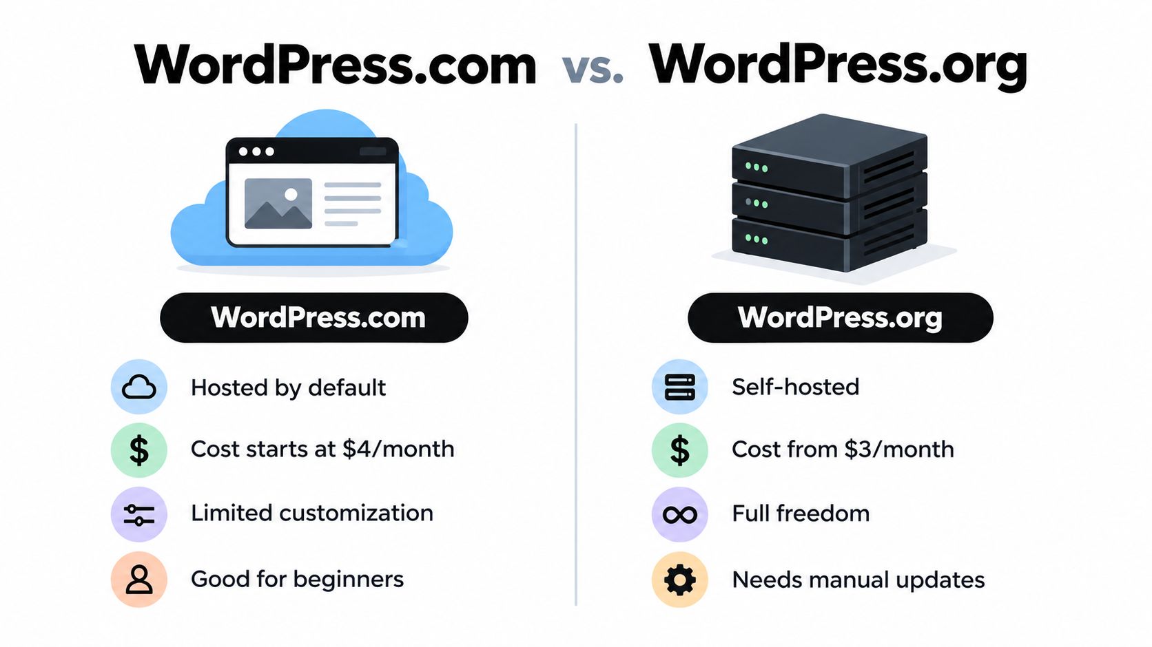
The theme supports straightforward list archives as well as more visual patterns. Astra Pro adds columns, masonry, a highlighted first post, and deeper spacing controls. Global container settings, including a narrower option, can apply across archives and single posts, which helps maintain a consistent reading width instead of letting every template drift.

That consistency matters for a guide site. A publication such as the WordPress guide archive benefits from predictable cards, visible categories, and a single-post template that moves cleanly from title to metadata to content. Astra's documented blog layout classes and hooks also give developers room to extend the theme without rebuilding the whole front end.

Where Astra earns its place

Astra's strongest advantage is its balance between accessible setup and progressive customization. Editors can make useful changes through familiar controls, while developers can use hooks and theme architecture for more exact behavior. Its broad template and plugin ecosystem also makes it easier to connect a blog to forms, SEO tools, newsletters, or commerce later.

The limitation is the boundary between the base theme and Astra Pro. More advanced grid, masonry, column, and spacing controls sit behind the paid add-on. That isn't necessarily a problem, but it changes the cost calculation for a small blog that only needs a clean list and readable articles.

The marketing site can also feel broader than the actual need. If you're selecting only a theme for a simple publication, ignore bundle language and evaluate the specific archive, single-post, typography, and responsive controls you'll use.

Best for: editors who want familiar controls, developers who value hooks, and blogs that may expand beyond a simple archive.

3. GeneratePress

GeneratePress is the strongest fit when performance discipline and precise template control matter more than visual spectacle. Its clean markup, lightweight styling, and close relationship with the block editor give publishers a stable foundation for reading-focused sites. The theme keeps the content structure separate from decorative effects, which reduces the temptation to build every post as a one-off page.

The free foundation handles the basics. GP Premium adds blog columns, featured-first posts, masonry grids, and more detailed archive behavior. You can configure archive, search, blog, and single-post sidebars separately, so a search result doesn't have to inherit the same clutter as an article page. Infinite scroll is available as an option, though numbered pagination is often easier for readers and editors to understand.

Control without content lock-in

GeneratePress becomes particularly useful through its Theme Builder and Elements features. Those tools let you control blog cards, post templates, hooks, and conditional placements while keeping the actual article content in WordPress blocks. That separation matters if you later change themes or redesign the publication.

For a high-frequency site, the layout can stay intentionally plain. Use a compact archive card with a title, category, date, and short excerpt. Keep the single-post template focused on the headline, byline, featured image, and article body. Avoid adding every available widget just because the system permits it.

A fast blog layout usually comes from fewer decisions, not more controls.

The trade-off is that many of the features people associate with polished blog archives, including columns and masonry, require GP Premium. GeneratePress also asks for more deliberate design work than a theme built around large starter demos. That restraint benefits experienced editors, but beginners may need to establish their own spacing, typography, and card rules.

Best for: speed-focused publishers, developers, and editorial sites that want fine control without builder-heavy content.

4. Kadence Theme

Kadence addresses the publisher who wants visual control without abandoning a performance-minded, blocks-first workflow. The theme provides archive and single-post settings at the theme level, while Kadence Blocks adds reusable sections, cards, and content patterns inside the block editor. That combination makes it easier to create a distinctive site without handing every article to a proprietary page builder.

Starter templates shorten the path from blank installation to a credible blog homepage. They can be useful for small businesses or solo creators who know the content direction but don't want to design every header, footer, and archive card from scratch. The header and footer builders also support more structured navigation than a minimal theme's default controls.

A good middle ground for growing sites

Kadence works well when the publication needs more than a plain list but less than a magazine system. You can establish a branded archive, create reusable blog cards, and apply consistent sections across categories. Accessibility-minded markup and a block-editor workflow also support a more maintainable handoff between editors and developers.

The risk is overbuilding. Kadence Blocks can make a homepage feel polished quickly, but each reusable pattern becomes another component to document and maintain. If authors can insert arbitrary variations everywhere, the site may lose its visual rhythm. Define a small set of approved patterns for archive cards, callouts, author information, and related posts.

The ecosystem is also broader than a simple blog may need. Kadence's connection to products such as Shop Kit and membership tools can help a site expand, but it may make the packaging feel unnecessarily large for a publication focused only on articles.

Best for: non-developers who want branded layouts, block-based reuse, and room to grow into a broader content site.

5. Blocksy

Blocksy is aimed at publishers who need a capable free starting point with detailed control over archives, cards, and individual posts. Its Gutenberg-first approach keeps the editor close to WordPress, while the Customizer exposes settings for archive presentation, card design, metadata, and single-post structure.

That makes Blocksy useful for a publication with several content types but no desire to adopt a large magazine builder. You can create a clear category archive, control which metadata appears, and add related posts without turning the article page into a collection of competing modules. The responsive controls also support a mobile-first approach, where the desktop layout is not just squeezed onto a smaller screen.

Powerful settings need a publishing rulebook

Blocksy's free tier is generous enough for many standard blogs. The Pro add-on adds custom archive and single templates through Content Blocks, along with conditional headers and footers. Those tools are valuable when different sections need different presentation rules, such as a resource archive that requires stronger filtering or a blog archive that emphasizes recency.

The downside is choice overload. Editors can adjust many details, and an unplanned setup can produce inconsistent card heights, metadata order, spacing, and mobile behavior. Establish the content hierarchy before opening the Customizer. Decide whether the archive is a list or a uniform card grid, define the role of the sidebar, and keep the single-post sequence stable.

Blocksy's block-editor compatibility is a practical advantage for portability. Keep article content in core blocks where possible, and reserve custom Content Blocks for reusable layout elements. That approach limits dependence on theme-specific structures while still allowing deeper customization when the publication needs it.

Best for: flexible small businesses, Gutenberg-first blogs, and editors who want strong free features with an upgrade path.

6. Neve

Neve solves the setup problem: launching a clean, responsive blog quickly without asking a beginner to design every component from zero. Its lightweight structure, starter-site library, and Gutenberg-powered demos provide a practical route to a readable homepage and archive. Otter Blocks patterns extend that workflow with reusable sections for editors who want more than the default theme styling.

The theme's header and footer builder supports multiple header rows and drag-and-drop placement. That helps a small publication create a clear primary menu, search access, and utility links without custom code. The main design decision remains simple, keep the article area prominent and make the navigation support discovery rather than compete with it.

Where Neve fits best

Neve's minimal defaults suit reading-focused blogs. A beginner can start from a prebuilt blog layout, replace the demo content, and maintain the result through familiar WordPress tools. That reduces the customization burden for a solo creator or small business owner who needs to publish rather than become a theme developer.

Still, starter sites create a maintenance obligation. Remove unused patterns, plugins, fonts, and decorative sections after importing a design. A demo can look coherent because every component was chosen together. Once you mix templates from different demos, the typography and spacing can become uneven.

Pricing also deserves a careful checkout review. Neve Pro promotions and displayed prices may use different currencies, including EUR, so verify the current USD amount and renewal terms before committing. The important decision isn't the promotional label. It's whether the premium controls solve a real archive, header, footer, or workflow problem.

Best for: beginners, fast launches, simple blogs, and teams that prefer starter patterns over bespoke design.

7. Newspaper

Newspaper solves the content-volume problem: organizing a publication with many categories, featured stories, promotional areas, and magazine-style entry points. The tagDiv theme includes a large Cloud Library with 1,300+ pre-made templates and elements, as described on its ThemeForest product page. It also includes the tagDiv Composer, front-end building, and 120+ one-click demos.

That breadth makes sense for a news or editorial operation. A category homepage can emphasize featured content, secondary stories, topic modules, and advertising positions without assembling every component manually. WooCommerce-ready elements also give a content-heavy site a route toward commerce if that becomes part of the publishing model.

The cost of magazine flexibility

Newspaper is less suitable for a lean, text-first blog that mainly needs an archive, search, and readable single-post template. The builder-dependent workflow adds a layer between WordPress content and the rendered page. If a layout relies heavily on tagDiv Composer, switching themes later may require more cleanup than a site built mostly with core blocks.

The design can also encourage visual density. Featured grids and multiple content rows help readers discover more stories, but they can bury the primary task on mobile. Treat the homepage as a navigation surface, not a miniature version of every article. Keep the single-post template quieter, with a controlled content width, clear headings, and related links after the main text.

For a practical publishing model, pair Newspaper's category strength with editorial rules. Limit the number of featured modules, define which categories receive homepage prominence, and review mobile archives before adding another carousel or promotional block. The theme's capabilities are useful only when the team can maintain the hierarchy.

The blogging tips archive is better served by a restrained content-first layout than by a full magazine front end. Newspaper earns its place when the publication has enough content volume to justify those additional surfaces.

Best for: newsrooms, magazines, and high-volume sites that need prominent categories and featured areas.

Top 7 WordPress Blog Layouts Comparison

ItemComplexity 🔄Resource Needs ⚡Expected Outcomes 📊Ideal Use Cases 💡Key Advantages ⭐
Read More InfoLow, content‑first, minimal setup 🔄Low, WordPress + RSS, no paid tiers ⚡Practical, actionable guides; easy syndication 📊Beginners, solo creators, small biz publishers 💡Standards‑based RSS, accessible, lightweight ⭐
Astra (Brainstorm Force)Medium, Customizer controls; Pro adds depth 🔄Medium, free core; Pro for advanced layouts ⚡Flexible archives and layouts; extensible via hooks 📊Editors needing predictable UI and ecosystem plugins 💡Mature docs, large ecosystem, predictable controls ⭐
GeneratePress (EDGE22)Low–Medium, lightweight by default; Premium for extras 🔄Low, minimal CSS; GP Premium for grids/theme builder ⚡High performance and precise layout control 📊Performance‑focused blogs and block‑editor sites 💡Very lightweight, stable filters, accessible out of the box ⭐
Kadence Theme (KadenceWP)Medium, blocks‑first visual workflow; moderate learning curve 🔄Medium, theme + Kadence Blocks; some paid modules ⚡Visually flexible templates with accessibility focus 📊Editors who want visual design without heavy bloat 💡Strong block integration, starter templates, growing ecosystem ⭐
Blocksy (CreativeThemes)Medium, many options; Gutenberg‑first but initial setup can overwhelm 🔄Low–Medium, capable free tier; Pro unlocks templates ⚡Robust block‑based publishing and customizable archives 📊Gutenberg users wanting powerful free features and customization 💡Generous free features, intuitive Customizer, competitive pricing ⭐
Neve (ThemeIsle)Low, quick setup with starter sites and simple UI 🔄Low, starter library + Otter Blocks; Pro for more ⚡Fast, uncluttered blogs with responsive archives 📊Simple reading‑focused blogs needing fast launch 💡Minimal styling, easy maintenance, good starter demos ⭐
Newspaper (tagDiv)High, builder‑heavy with many templates and options 🔄High, large Cloud Library, heavier asset footprint ⚡Magazine‑style, feature‑rich layouts and ad placements 📊High‑volume news/magazine sites requiring many templates 💡Extensive pre‑made templates, polished featured areas, ThemeForest support ⭐

Choose the Layout That Matches Your Publishing Model

Start with the reading experience, not the theme demo. A Read More Info-style approach is the clearest choice when visitors need uncluttered articles, responsive access, search, and RSS discovery. It keeps the publication portable and gives editors fewer ways to create inconsistency.

Choose Astra, GeneratePress, Kadence, Blocksy, or Neve when you need a balance between performance and progressively deeper customization. Astra suits familiar Customizer controls and a broad ecosystem. GeneratePress is the disciplined performance option for teams comfortable defining their own system. Kadence offers a strong middle ground for block-based visual control. Blocksy gives a capable free foundation with detailed archive options. Neve is the quickest route from starter layout to maintainable blog.

Reserve Newspaper for a different publishing model. Its magazine templates, category surfaces, and featured grids are appropriate when content volume and discovery justify a denser interface. It isn't the default answer for a small informational blog, because builder dependence and visual complexity can add maintenance work without improving the core reading task.

Before choosing, test the actual publishing workflow rather than only the homepage. Use representative posts with long headings, featured images, lists, embeds, and multiple H2 sections. Then check the archive, search results, category pages, and an empty search state on a phone.

Use this final decision checklist:

  • Archive density: Decide whether readers need a calm list, uniform cards, or a magazine grid.
  • Single-post width: Keep the text column comfortable and prevent full-width layouts from creating tiring line lengths.
  • Sidebar purpose: Include a sidebar only when it supports navigation, subscription, or useful context.
  • Mobile behavior: Check menus, cards, images, sticky elements, and content order on small screens.
  • Search and empty states: Make it easy to find content and recover when no result exists.
  • RSS access: Confirm that posts and, where relevant, comments remain available through standard feeds.
  • Accessibility: Test keyboard focus, heading hierarchy, contrast, labels, skip links, and screen-reader flow.
  • Plugin dependence: Identify which layout elements disappear or become difficult to edit if a builder is removed.
  • Maintenance: Document spacing, card structure, image ratios, metadata, and approved blocks before several authors start publishing.

A sustainable layout also supports the broader business goal. If your site must publish consistently, support multiple authors, and evolve without repeated rebuilds, scaling your brand with a content management system depends on repeatable templates more than visual novelty. The best WordPress blog layouts are the ones your team can keep coherent after the launch excitement ends.


Read More Info offers practical WordPress guidance, open RSS access, built-in search, and a lightweight mobile-friendly reading experience for creators and small publishers. Visit Read More Info to study a restrained layout model, browse publishing guides, and find concrete help before you commit to a theme.

How to Create WordPress Blog: The Smart Way

It takes roughly 30 minutes to launch a basic WordPress blog if you choose the right path immediately, but skipping that setup decision can cost weeks of migration work later. The practical answer is to choose WordPress.com for convenience or self-hosted WordPress.org for control, then connect a domain, install only the tools you need, publish a focused first post, and check security, speed, and discoverability before sharing it.

You're probably looking at an empty dashboard, an available domain name, and a growing list of tutorials that all seem to start in a different place. Most failed launches don't fail because WordPress is difficult. They fail because the owner chooses the wrong hosting model, installs too many plugins, spends days polishing a theme, or publishes without setting up ownership, backups, search structure, and a reliable content workflow.

WordPress has been officially available since May 27, 2003, and by 2026 it powered about 40.2% of all websites and 58.8% of websites with a known CMS (W3Techs' WordPress market data). That scale matters because the publishing interface, theme ecosystem, documentation, and support community are mature. You can move quickly, but only if you make the important decisions before the cosmetic ones.

Table of Contents

Choosing Your WordPress Path Before You Start

The first decision isn't your logo, homepage color, or theme. It's whether you want WordPress.com, a managed service, or self-hosted WordPress.org, where you arrange hosting and manage the installation yourself.

WordPress.com handles much of the infrastructure for you. That's useful if you want to write, select a design, and avoid server maintenance. Self-hosted WordPress.org gives you more control over plugins, themes, data, monetization, integrations, and the technical stack, but you're responsible for updates, backups, hosting quality, and security.

The platform's broad adoption makes either route viable. Current tracking places WordPress at roughly 40% to 43.5% of all websites globally and about 59% to 61.7% of CMS-based websites, depending on the source and date (WordPress.com's market-share overview). Those figures describe different measurements, not a contradiction. They do show why learning how to create a WordPress blog transfers well across hosts and workflows.

A comparison chart showing the key differences between the WordPress.com and WordPress.org platforms for website building.

Use this decision matrix

FeatureWordPress.comSelf-Hosted WordPress.org
Hosting responsibilityManaged for youYou choose and manage a host
Technical maintenanceLowerHigher
Plugin and theme freedomDepends on the planBroad control
Data and infrastructure controlMore limitedMore direct ownership
Best fitPersonal publishing and low-maintenance projectsBusinesses, publishers, and growth-focused sites
Main trade-offConvenience versus flexibilityFlexibility versus responsibility

Choose WordPress.com when simplicity is the product. Choose self-hosting when the blog is part of a business, publication, portfolio, membership site, or long-term content asset and you want the ability to change providers and systems without redesigning your entire operation.

Practical rule: If you already know you'll need custom plugins, advanced analytics, complex forms, or full control of your files, don't start on the simpler path just to save an afternoon.

For another practical perspective on the ownership and setup choice, use this guide to starting a blog with Outrank. Decide before you write content, because changing paths later can involve redirects, media transfers, theme rebuilding, plugin replacements, and email-list adjustments.

Securing Your Domain and Setting Up Hosting

A domain is the public name people type into a browser. Hosting is the service that stores your WordPress files, database, images, and other resources so that the domain can display your site. You need both for a self-hosted blog, while WordPress.com bundles the infrastructure into its managed experience.

Pick a domain that's easy to say, spell, remember, and extend into a broader publication if your topic evolves. Avoid names that lock you into one narrow product unless that limitation is intentional. Check the registration terms, renewal conditions, privacy options, migration policy, support quality, backup approach, and staging tools before treating the lowest introductory price as the best deal. For background on choosing and managing a domain, see this domain resource.

A clean self-hosted setup

  1. Register the domain. Use a reputable registrar and confirm that you control the account email and renewal settings.
  2. Choose hosting. Look for current WordPress and PHP support, automated backups, SSL, caching, staging, clear restore procedures, and responsive support. A cheap host that makes every problem a ticket can consume more time than it saves.
  3. Connect the services. Your host will provide the connection instructions needed to make the domain point to the hosting account. Follow the host's current documentation rather than copying values from an old tutorial.
  4. Install WordPress. Most beginner-friendly hosts provide a guided or one-click installer. Create a unique administrator username and a long password, then record access details in a password manager.
  5. Confirm HTTPS. Visit the site with the secure address and check that the browser doesn't show certificate warnings. Test the login page, homepage, and a sample image.

WordPress.com users can follow the service's guided onboarding, select a site address, and configure the publishing settings inside the dashboard. The process is easier because the host controls the environment, but that convenience is exactly why you should confirm ownership, export options, domain terms, and plugin availability before building into the platform.

Keep administrator access limited. Create separate author accounts for contributors, use the lowest permission level that fits each person's role, and remove unused accounts. A launch is easier to recover when one compromised login doesn't provide access to every part of the site.

Building Your Site with the Right Tools

A blog can lose speed and consistency before its first post if the setup depends on too many visual effects or plugins. Choose a lightweight theme with clear controls for headings, navigation, featured images, author details, categories, and mobile layouts. A polished demo is not enough. If the theme loads unnecessary scripts or makes routine edits awkward, every future post takes longer to publish.

A creative workspace featuring a laptop, tablet, and smartphone displaying WordPress development and website design interfaces.

Select the smallest useful stack

Begin with one theme and a short plugin list. Add only the functions your launch needs, such as security, backups, SEO, caching or performance controls suited to the host, forms, or editorial workflows. Test every addition, keep it updated, and remove abandoned plugins. An inactive plugin still creates maintenance work and another piece of software that could expose the site.

Security rewards restraint. Recent WordPress security data attributes roughly 91% of vulnerabilities to plugins and about 6% to WordPress core, while the median time to mass exploitation is about 5 hours (Melapress WordPress security statistics). Those figures support a practical rule: install fewer plugins, select maintained projects, update promptly, and protect accounts with layered authentication. The same source reports that 70% of survey respondents implement 2FA, making two-factor authentication a sensible launch requirement rather than an advanced extra.

Page builders create a real trade-off. They can provide more visual control, but they may add editor complexity, styling dependencies, and performance overhead. Use this guide to compare WordPress page builders before committing. For a content-led blog, the native block editor often covers the job without another builder.

Free tools can support production, but only when each one has a defined role:

  • Office documents: ONLYOFFICE Desktop Editors runs on Windows, Linux, and macOS and supports text documents, spreadsheets, presentations, fillable forms, PDFs, comments, and freehand drawings (ONLYOFFICE Desktop Editors).
  • Online utilities: Free.ai catalogs 477 free tools across 20 categories without requiring sign-up, including an AI Humanizer, AI OCR, Keyword Extractor, PDF OCR, AI Handwriting OCR, and AI Receipt Scanner (Free.ai's tool directory).
  • Free video editing: DaVinci Resolve or CapCut Desktop can export MP4. Compress the finished file with HandBrake before uploading it to WordPress.
  • Keyword research: Free.ai's Keyword Extractor can support initial topic collection. Make final choices from audience problems and search intent, not from suggestions alone.
  • Blog graphics: Canva handles basic thumbnails, featured images, and image edits without adding a complex design application.
  • Wireframes and diagrams: draw.io is free for standalone use and works offline, making it practical for sketching site structures before building them (Zapier's process-mapping roundup).
  • Customer management: EngageBay is listed as a free CRM option for small businesses in the same roundup. Add it only if the blog has a real lead-management process.
  • Budgets and charts: Wave is listed as a free accounting option, while WPS Office covers budgeting, data organization, and chart creation (WPS Office).
  • Diagrams and documents: Use draw.io for wireframes and LibreOffice for documents, spreadsheets, presentations, drawings, and charts. Add specialist software only when it solves a defined publishing or reporting need.

Searches for free daemon tools, free zip tools, free pro tools download, and pro tools free download can lead to unofficial or modified software. Avoid installing those files on the computer used for administrator credentials. Download from official vendors, use built-in operating-system utilities, or choose reputable open-source alternatives.

The strongest launch stack is deliberately ordinary: a fast theme, controlled plugins, protected accounts, repeatable image preparation, and tools the team can explain. That setup saves more time than an elaborate homepage builder and leaves fewer problems to diagnose later.

Creating and Formatting Your First Post

A blog becomes useful when a reader can understand one problem and one answer without fighting the layout. Open Posts, create a new post, write a specific title, and use the block editor to build a clear sequence of headings, paragraphs, lists, images, links, and calls to action.

Start with the reader's outcome. A title such as “How to Create a WordPress Blog” states the topic, while a more useful angle promises a decision or result, such as choosing the right setup without migration regret. Keep the introduction short, explain who the post helps, and answer the core question before adding background.

Build the post for scanning

Use one H1 supplied by the post title, then organize the body with H2 and H3 headings. Keep paragraphs short, use descriptive link text, and place images beside the explanation they support. Add a featured image, choose one primary category, and use tags only when they improve navigation rather than creating a cloud of near-duplicates.

The block editor lets you insert images, buttons, columns, quotes, tables, videos, and reusable patterns. Don't add a block because it exists. Add it when it improves comprehension, gives the reader a next action, or makes a complex idea easier to compare.

Before publishing, inspect four areas:

  • Slug: Remove unnecessary words and keep the address readable.
  • Media: Add useful alternative text and resize oversized files before upload.
  • Links: Connect the new post to relevant pages and older posts, and verify every link.
  • Distribution: Confirm the featured image and description that social platforms may use.

RSS is a low-friction distribution channel because readers can subscribe through feed readers and aggregators instead of remembering to revisit your site. WordPress commonly provides a site feed automatically, but you should open the feed URL, confirm that the latest post appears, and check that your theme or plugin hasn't accidentally hidden or replaced it. A practical publishing reference for post setup and formatting is this WordPress blog guide.

Don't mistake a polished draft for a tested post. Preview it at desktop and mobile widths, open the published URL in a private browser window, test the images and internal links, and read the first paragraph as someone who has never heard of your site.

Optimizing for Search and Performance

Search optimization starts with alignment, not plugin scores. Choose a topic that answers a real question, use the language readers use, and make the page easier to understand than competing results. A plugin can identify missing fields, but it cannot decide whether the post is useful enough to earn attention.

Set a readable permalink structure before your archive grows. Use a concise topic-based slug, write a unique title, and create a meta description that explains the page instead of repeating keywords. Question-form headings can work when they match the reader's intent. Answer each question directly, then add the supporting detail.

AI search makes clear structure more useful. Some SEO practitioners recommend question-form headings, FAQ schema when the content qualifies, concise answers for answer engines, and checks of robots.txt for crawler access. Some publishers are also considering llms.txt, but treat it as an optional emerging practice, not a replacement for accessible pages, clear HTML, strong writing, and accurate structured data (answer-engine guidance for WordPress).

A list of four essential tips for improving SEO and website speed, including meta tags and compression.

Treat speed as a deployment requirement

Core Web Vitals guidance classifies LCP under 2.5 seconds, INP under 200 milliseconds, and CLS under 0.1 as healthy thresholds (WordPress performance benchmark guidance). The same benchmarking report found that only about 44% to 46% of WordPress sites pass all three metrics on mobile, while about 65% of pageviews pass the TTFB measure. Hosting, caching, and backend response time deserve attention early.

The practical interpretation is simple: test your site with real mobile conditions, not only a fast desktop connection. Reduce oversized images, avoid autoplay media, limit third-party scripts, choose caching that matches your host, and remove plugins that duplicate each other.

Use this launch checklist:

  • Check the largest element: Compress the hero image and confirm it is not loaded at an unnecessarily large size.
  • Check interaction: Remove decorative scripts that delay menus, forms, or navigation.
  • Check layout stability: Reserve image dimensions so content does not jump while assets load.
  • Check server response: Ask your host about caching, database load, and backend bottlenecks if the initial response is slow.
  • Check crawlers: Review robots.txt, XML sitemap behavior, canonical URLs, and no-index settings before promotion.

Performance work should protect the reading experience, not turn into a score-chasing exercise. A clear page that loads reliably and answers a defined question has a stronger foundation than a visually ambitious page that keeps readers waiting. The best launch setup removes technical friction without burying the content under unnecessary tools.

Launching with Confidence and Next Steps

A successful launch isn't the moment you click Publish. It's the point at which a stranger can find the site, understand its purpose, read the post on a phone, contact you, and return later without encountering broken links, insecure forms, or missing images.

Run the site as a visitor first. Log out of WordPress, open the homepage, click the logo, test the navigation, search for a phrase that should exist, submit a contact or newsletter form if one is installed, and confirm the success message. Then check the same flow on a phone and in a private browser window.

Use a compact pre-launch review

  • Ownership: Confirm domain access, registrar email, hosting access, and administrator recovery options.
  • Content: Publish an About page, a contact route, privacy information, and a useful first post.
  • Navigation: Make the blog, categories, search, and key pages reachable without guesswork.
  • Security: Remove unused plugins and themes, update the active stack, use strong authentication, and verify backups.
  • Search: Check indexing settings, titles, descriptions, canonical behavior, sitemap access, and internal links.
  • Performance: Test mobile rendering, image sizes, interaction, layout movement, and server response.
  • Distribution: Confirm RSS output and prepare a simple way for readers to subscribe or follow updates.

Don't assume that a technical score creates an audience. Search engines need accessible, useful content, but readers need a clear reason to trust the site and return. Publish on a schedule you can sustain, review analytics for questions rather than vanity totals, answer legitimate comments, and update posts when facts, links, or screenshots change.

Keep a small change log. Record the theme, plugins, settings, redirects, tracking tools, and backup location. When a future update causes trouble, that record turns a vague debugging session into a short comparison between what changed and what broke.

As your site grows, an opt-in form can turn one-time visitors into an audience you can reach directly. Plan that connection carefully with an opt-in form resource, and keep the form's promise specific, honest, and easy to understand.

The common assumption is that launching a WordPress blog is mainly an installation task. In practice, installation is the easy part. Ownership, restrained tooling, useful content structure, security discipline, and performance checks determine whether the site remains manageable after the first post.


Read More Info offers a straightforward WordPress publishing environment with informational posts, site search, and RSS feeds for readers who prefer feed readers and aggregators. Visit Read More Info to explore the site and see how a simple publishing structure can support ongoing content discovery.