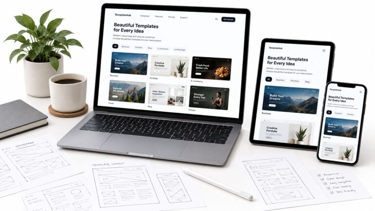
The most popular advice in the mobile friendly vs mobile responsive debate is also the least reliable. Pick a responsive theme, you're told, and mobile is solved. That isn't true. A responsive layout can stack neatly into one column and still load slowly, shift while people read, or hide content that search engines need to index. A site can also earn the mobile friendly label through a separate mobile version that works well today but drifts away from the desktop version over time.
The useful question isn't which label sounds better. It's what each approach guarantees, what it leaves untested, and how you'll verify the result on a real phone. Measured that way, responsive design is usually the safer default for a new build, but it's the start of the work, not evidence that the work's done.
Table of Contents
- Mobile Friendly and Mobile Responsive at a Glance
- What Mobile Friendly Means in Practice
- How Responsive Layouts Adapt to Any Screen
- Where Performance Diverges on Mobile
- What Actually Affects Mobile Search Visibility
- Which Approach Fits Your Site
- Choose Responsive Design and Test It on Real Phones
Mobile Friendly and Mobile Responsive at a Glance
Mobile friendly describes whether a page works on a phone. Mobile responsive describes how the site is built to adapt to any screen. One is an outcome a visitor experiences, the other is a construction method a developer or theme applies. That's why the terms overlap without meaning the same thing.
The stakes aren't marginal. By the end of 2023, 4.6 billion people, 57% of the global population, used mobile internet, according to the GSMA State of Mobile Internet Connectivity 2024 report. A page that only works comfortably on a desktop monitor is ignoring how most readers now arrive.
| Criterion | Mobile friendly | Mobile responsive |
|---|---|---|
| Core meaning | Readable and usable on a phone | One flexible layout that adapts to any screen width |
| Typical build | Separate mobile layout, fixed breakpoints or limited adjustments | Fluid grids, flexible images and CSS media queries |
| URL structure | May use a separate mobile version | Same URL and HTML for every device |
| Tablets and resizing | Depends on the breakpoints chosen | Adapts continuously to the viewport |
| Maintenance | Two versions can drift apart | One codebase to update |
| Ranking relevance | Passes Google's mobile usability criteria when implemented correctly | Recommended by Google for new websites; content stays identical across devices |
| Performance risk | Heavy mobile pages still possible | Heavy assets served to every screen still possible |
Read the table as a map. Build, tablet behavior, and maintenance come down to how the layout is constructed. Performance risk is a separate problem, because either approach can ship oversized images and scripts. Ranking relevance is separate again, because search visibility depends heavily on whether the mobile version carries the same content as desktop.
A mobile friendly page can pass usability checks and still cost you double maintenance, while a responsive page can adapt perfectly and still be slow.
Those two cases explain most confusion around the terms, and they're the reason a label alone shouldn't guide your decision.
What Mobile Friendly Means in Practice
The term became commercially unavoidable on April 21, 2015, when Google began rolling out its mobile friendly ranking update. Google's announcement of the mobile friendly update says the change applied to mobile searches in every language and country, boosted pages designed to remain legible and usable on phones, and affected individual pages rather than entire websites. It didn't apply to desktop or tablet searches.
The usability bar Google published
Google's criteria were practical, not technical for their own sake:
- Readable text: Visitors shouldn't need to tap or pinch to zoom before reading.
- Spaced tap targets: Links and buttons need enough separation that a thumb hits the intended one.
- Playable content: Embedded media must work on the phone, not depend on software it can't run.
- No horizontal scrolling: Readers shouldn't have to drag the page sideways to finish a line.
A page can meet all four criteria through a separate, narrow mobile version. Nothing in that list requires one fluid layout. That's the practical opening for a non-responsive but still mobile friendly site, and also its weakness, because someone has to keep that second version current.
Say a small shop publishes a desktop price table with five columns. On a phone the table loads, so in a shallow sense it works. But a customer has to scroll sideways to compare the final price column with the product name in the first. The page opens, it just doesn't pass.
A five-minute phone audit
You don't need software for a first check:
- Open the page on your own phone, not an emulator.
- Read the first paragraph without zooming.
- Tap the menu and footer links, watching for missed taps.
- Try scrolling sideways and confirm the page doesn't allow it.
- Play any embedded video and submit any form or search box.
A pass means the page is legible, navigable, and complete, not merely loading. For a WordPress publication covering RSS and feed readers, site search, responsive design, and web basics, that completeness matters, because search and feed links are part of the reading experience, not extras. We publish articles on those topics ourselves, so a phone test that ignores search or subscription paths would miss how readers use the site.
How Responsive Layouts Adapt to Any Screen
Responsive design works in a specific build order, and the first step isn't visual. The viewport declaration in the page head tells a mobile browser to render at the device's actual width. Without it, the browser assumes a wider virtual canvas and scales everything down, so text shrinks and breakpoints fire at the wrong sizes, or don't fire at all.

With the viewport set, three tools do most of the work. Fluid grids size columns in percentages rather than fixed pixels, so a two-column layout compresses gradually instead of breaking at a single width. Flexible images scale within their container, with responsive image sources serving a smaller file to a smaller screen. CSS media queries then rearrange the layout at chosen points, stacking a sidebar below the article or collapsing navigation into a menu button. The W3C mobile adaptation roadmap describes how media queries, flexible grids, responsive images, and viewport-relative units such as vw and vh continuously adapt presentation to changing viewport dimensions.
Why one URL matters for WordPress
A responsive WordPress theme serves the same post URL, HTML content, RSS endpoints, and semantic structure to phones, tablets, and desktops. You edit the article once, and every device shows the corrected version. That single-codebase property is the maintenance argument for responsive design, stronger than any visual claim. For builders planning a new site, mobile-first design advice from Netco Design is a useful companion on ordering phone decisions before desktop ones.
This video walkthrough shows the resizing behavior in motion, which static screenshots can't convey:

This video is hosted by YouTube (Google). Pressing play loads the video from YouTube, which may set cookies and share data with Google.
Validate beyond your own phone
- A narrow phone and horizontal orientation, where headers and menus often collide.
- A tablet and a slow desktop resize, to catch awkward widths between breakpoints.
- 200 percent zoom and keyboard-only navigation.
- A very long article title, which breaks fixed-width cards that looked fine in testing.
Practical rule: Responsive describes how the page is arranged. It says nothing about how heavy the page is.
Where Performance Diverges on Mobile
A responsive layout can still be slow. Page weight and screen layout measure different things, so the responsive label alone cannot predict what visitors experience. HTTP Archive's 2025 page weight dataset reports a median home page weight of approximately 2.6 MB on mobile and 2.9 MB on desktop. On mobile, pages weighing 2 to 3 MB had a median Largest Contentful Paint of 3.2 seconds. Pages under 1 MB still recorded about 2.6 seconds.
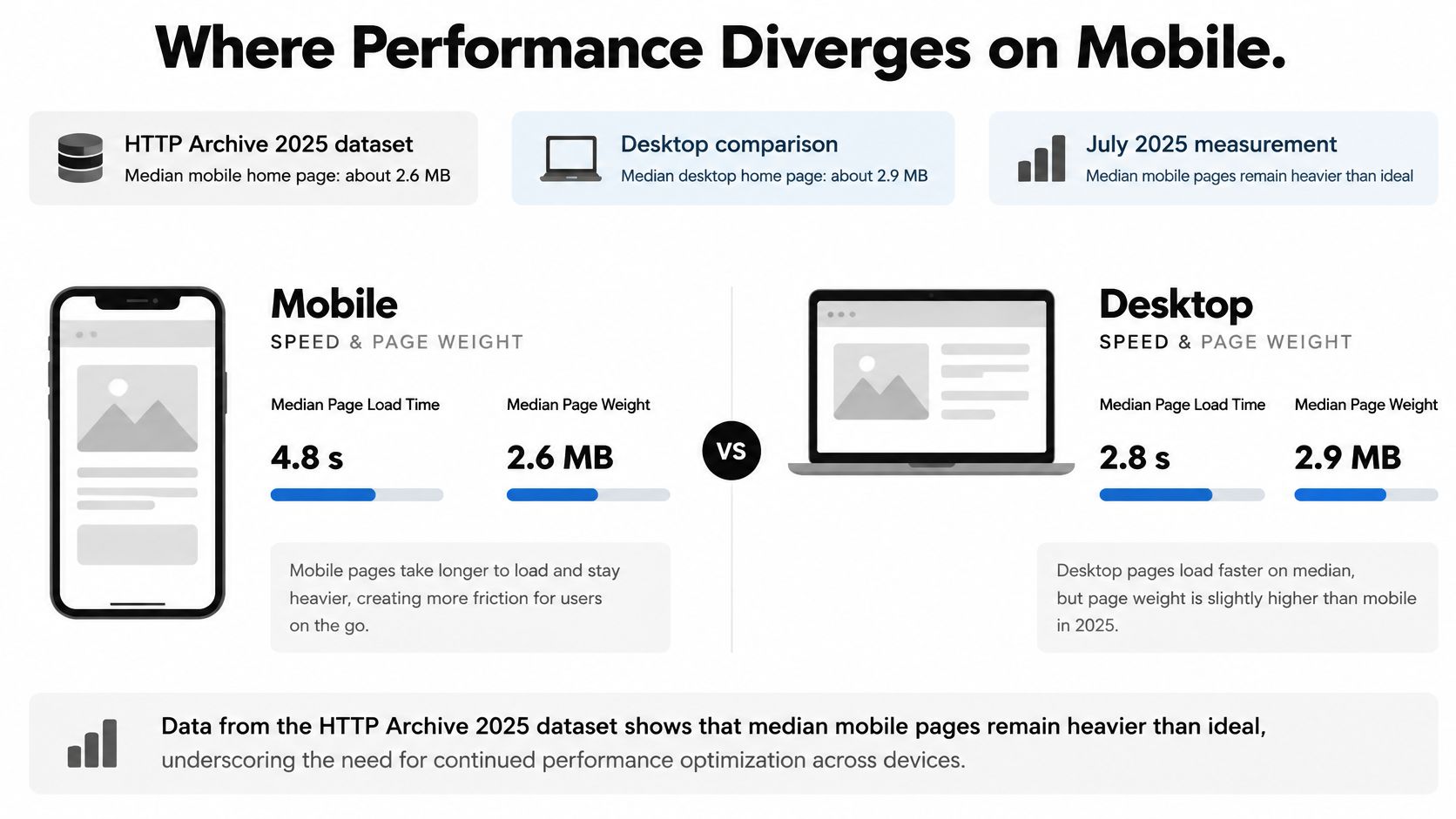
The broader trend shows that page weight is only part of the performance picture. SQ Magazine's web design statistics reports July 2025 measurements putting the median mobile homepage at roughly 2.36 MB, compared with about 845 KB in 2015, with JavaScript alone around 632 KB. The same measurements found that about 48% of mobile sites achieved good results across all Core Web Vitals, while median mobile Total Blocking Time was 1,916 milliseconds.
Three kinds of responsiveness
- Layout responsiveness: Columns, images, and navigation rearrange to fit the screen.
- Input responsiveness: Taps and form entries register promptly, without waiting for JavaScript.
- Network performance: Page data arrives fast enough over a mobile connection.
A responsive theme addresses layout, not necessarily input or network performance. For example, a site may serve a desktop-sized hero image to a small phone and shrink it with CSS. The image fits the screen, but the full file still has to download.
| Metric | Good threshold | 2025 mobile reference |
|---|---|---|
| Largest Contentful Paint | 2.5 seconds or less | About 3.2 seconds on pages of 2–3 MB; about 2.6 seconds under 1 MB |
| Interaction to Next Paint | Below 200 ms | Heavier pages tend to respond to taps more slowly |
| Cumulative Layout Shift | Below 0.1 | Stay below 0.1; reserve image dimensions to keep the layout steady |
| Total Blocking Time | Lower is better in lab testing | Median of 1,916 milliseconds on mobile |
| All three Core Web Vitals | All metrics in the good range | About 48% of mobile sites pass |
Heavier pages can delay both visual loading and interaction. Scripts take time to parse, and a phone may be busy processing them when a visitor taps a control. Resizing a desktop browser to phone width does not reveal that cost: it checks layout, often on faster hardware and a faster connection than mobile visitors have.
Controls that move the metrics
Serve properly sized WebP or AVIF images instead of shrinking large originals with CSS, and reserve explicit image dimensions to prevent layout shifts as files load. Defer noncritical scripts. Treat each plugin and ad tag as added work for the phone to process, then assess performance using 75th-percentile field data from real visitors, not a single lab run on an office connection. A strong lab score can conceal slower experiences among visitors.
What Actually Affects Mobile Search Visibility
The common assumption is that responsive design earns a direct ranking advantage over other mobile friendly implementations. The evidence doesn't support that framing. What Google changed is which version of your page it reads.
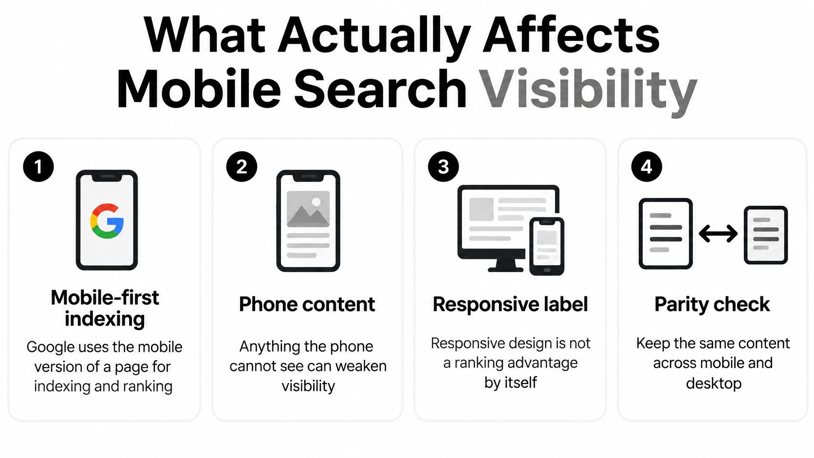
Under mobile-first indexing, Google uses the mobile version of a page for indexing and ranking. Google's mobile-first indexing documentation says important text, images, videos, metadata, structured data, and links should remain available on mobile, and that responsive design and correctly implemented dynamic serving are generally suitable. Google has recommended responsive web design for new websites, but the documentation doesn't present the label itself as the ranking mechanism.
Can a mobile friendly site rank
Yes, if its mobile version is complete. The useful question is what causes mobile SEO problems, and the answer rarely involves the design label:
- Missing mobile content, where a trimmed mobile page drops paragraphs, images, or product details the desktop page carries.
- Inaccessible navigation, so internal links exist on desktop but readers and crawlers can't follow them on a phone.
- Absent metadata or structured data on the mobile version.
- Poor performance, which degrades the page experience measurements covered earlier.
- Unusable controls, such as tap targets too close together or forms that can't be completed.
The label isn't the risk. Anything the phone version lacks is something search can miss.
The parity check that replaces guesswork
Compare desktop and mobile HTML directly. Confirm headings, body text, and internal links match, check that structured data appears on both versions, and verify titles and descriptions aren't missing or truncated on mobile. Test navigation and forms with a keyboard and a screen reader, because a menu that needs a mouse hover fails both. Then use the mobile usability and Core Web Vitals reporting in Google Search Console to find specific pages that fail, rather than assuming the whole site shares one verdict.
When content parity holds, a redesign is rarely needed for search reasons alone. The honest case for responsive design is narrower and stronger. One URL and one codebase make parity the default instead of a condition you must continually re-verify across two versions. That's an operational advantage, and it's enough to justify the choice without inventing a ranking bonus.
Which Approach Fits Your Site
The label matters less than the failure a design makes likely. Choose based on the kind of pages you publish, how versions are maintained, and what needs checking on a phone. This table matches common situations to a practical fit and a verification task.
| Site situation | Best fit | Verify first |
|---|---|---|
| Content blog on WordPress | Responsive theme on one URL | Long titles, images and search results on a phone |
| Small brochure site with few pages | Responsive, or mobile friendly if it is built on fixed breakpoints | Tap target spacing and no horizontal scrolling |
| Site with heavy ads or third-party scripts | Responsive layout with a strict performance budget | Largest Contentful Paint and Interaction to Next Paint on a real phone |
| Legacy site with separate mobile URLs | Move to responsive or keep the mobile version in full parity | Desktop and mobile HTML match for text, links and metadata |
| Web app with dense data tables | Responsive layout with a condensed table view | Table scrolling and form controls on a small screen |
| Image-heavy portfolio | Responsive images with reserved dimensions | Cumulative Layout Shift and image format sizes |
Three situations in detail
A content blog with long posts usually benefits from a responsive theme. Articles, search results, and feed entries remain on one URL, which readers can share across devices without choosing between versions. The likely weak point is presentation: long headlines and wide images can wrap awkwardly on narrow screens.
A small brochure site has fewer pages to keep aligned, so either approach can work if text is readable without zooming and tap targets are usable. For larger organizations considering a rebuild across departments, guidance on web development for enterprise teams discusses consistency across many pages. That concern is separate from whether a site is mobile friendly or responsive, so it does not determine the choice here.
A legacy site with separate mobile URLs faces a different risk: content drift. If someone updates desktop pricing but misses the mobile version, visitors and search systems may encounter outdated information. The relevant check is whether text, links, and metadata match across both versions.
Each row identifies a verification task that can expose a design problem. Heavy advertising or third-party scripts require performance checks, but they can affect either approach. A responsive label does not guarantee that a page loads quickly, and a fast page alone does not establish that its mobile content matches desktop.
The practical decision is therefore about what the site must maintain and what its visitors need to do. A responsive layout on one URL can reduce the chance of content drifting between versions, while a mobile-friendly design can still serve readers well if its content and controls work on phones. Neither label guarantees search visibility. Content parity and checks on actual phones provide stronger evidence than the terminology used to describe the design.
Choose Responsive Design and Test It on Real Phones
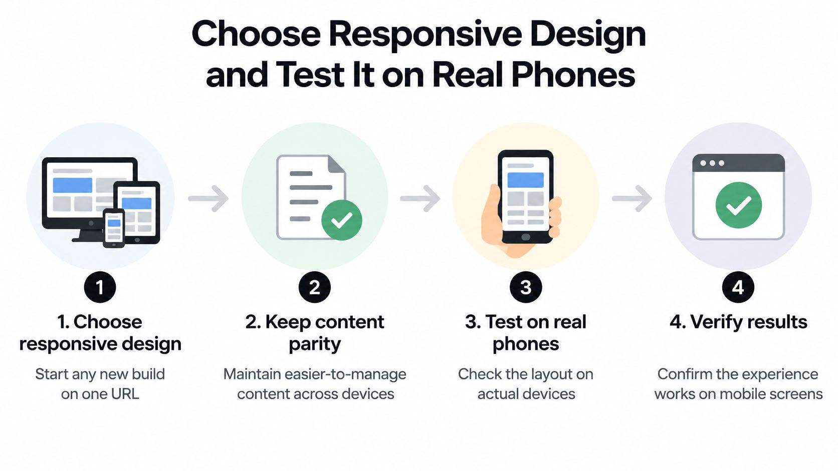
A responsive label does not prove that a page loads quickly, preserves its content, or works well on a phone. For a new build, choose a responsive layout on one URL, then verify what visitors receive. Google recommends responsive design for new websites, and one codebase makes content parity easier to maintain than two versions that must be reconciled after each edit.
An afternoon test sequence
- Confirm the viewport declaration in the page head. Without it, later checks may measure the wrong rendering.
- Open the page on a real mid-range phone over a throttled connection. A flagship device on office Wi-Fi can hide loading and usability problems.
- Check Largest Contentful Paint, Interaction to Next Paint, and Cumulative Layout Shift against the good thresholds, using field data when there is enough traffic.
- Compare desktop and mobile HTML for headings, links, metadata, and structured data. Then check keyboard and screen-reader access.
- Test search and feed links on the phone. A collapsed menu can make discovery paths harder to find or use.
- Complete the phone audit across a narrow screen, horizontal orientation, tablet, zoom, and a long headline.
Set pass conditions before testing. Step 3 fails when results exceed the stated thresholds; step 4 fails if a heading or link is missing; step 6 fails if pinch-to-read is needed. These checks distinguish measured performance and content parity from a page that merely looks acceptable at first glance.
Analyst's verdict: Choose responsive by default, then measure performance and check content parity on a real device before calling the site finished.
Test web pages at the screen size and connection speed readers experience. A responsive layout can still deliver a heavy page or make important content difficult to use, so the label alone is not evidence of a good result.
For WordPress beginners, theme choice makes this decision concrete. Read More Info publishes how-to guides on WordPress themes, scheduled posts, blog layouts, and site setup. A theme described as responsive still needs testing, because image handling and script weight can vary. Check its demo on a phone before installing it, and look for slow loading, missing content, or controls that are difficult to use.
The distinction is straightforward: mobile friendly describes whether a page works on a phone, while mobile responsive describes how its layout adapts. Build responsively, then check speed, content parity, and usability on a real device. The words on a theme listing cannot establish those results. X8 Web Design's business card guide is about print design, so it does not establish whether a web page performs well on a phone. Judge the page in the format and conditions readers use.