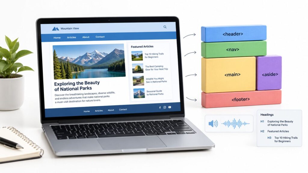
Responsive Design and Web Basics
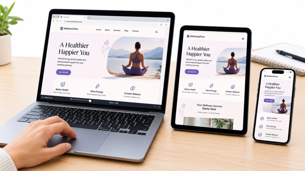
Responsive design means building a website so that its layout adapts to the size of the screen it is viewed on. A page that works on a laptop but forces phone visitors to pinch and scroll sideways loses readers quickly, and search engines now judge sites primarily by their mobile version. Getting the basics right is one of the most useful things a website owner can do.
This guide covers the core ideas behind responsive design, the basic building blocks that make a page adapt, and the common mistakes that break layouts on small screens. It is written for people who build or maintain simple websites and want to understand what is happening under the hood.
WHAT RESPONSIVE DESIGN MEANS
A responsive page uses flexible sizes instead of fixed ones. Text, images and columns resize to fit the available width, and the layout can change, for example from three columns on a desktop to a single column on a phone. The goal is one set of content that works across screen sizes, rather than a separate mobile site.
Google uses mobile-first indexing, which means it primarily looks at the mobile version of a page when deciding how to index and rank it. If the mobile version hides content, loads slowly or is hard to use, the site suffers in search regardless of how the desktop version looks.
THE BUILDING BLOCKS
Start with the viewport setting. Without it, many phones display a page at desktop width and shrink it down, making text unreadable. The standard fix is a viewport meta tag in the page head that sets the width to the device width. Most modern themes include it already, so check before adding it yourself.
Next, make images flexible. A simple rule is to set images so they never exceed the width of their container. This stops large photos from pushing the layout off the screen. Use fluid widths for containers, avoid fixed pixel widths for main content, and let text wrap naturally.
Finally, use media queries. These are rules that apply different styles at different screen widths, such as switching a navigation menu to a button on small screens. Choose breakpoints based on where your content breaks, not on specific device models, because new phones and tablets appear all the time.
MOBILE FIRST, DESKTOP SECOND
Many developers design for small screens first and then add styles for larger ones. This approach keeps the basic experience simple and fast, and it usually produces cleaner code. Starting with the phone also forces you to decide what really matters on the page, which tends to improve the desktop version as well.
TESTING WITHOUT A DEVICE LAB
You do not need a shelf of phones to test a layout. Browser developer tools include a device mode that simulates common screen sizes and touch input. Resize the window slowly and watch for the point where text, images or menus break. Then check the page on at least one real phone, because simulated tests miss things such as touch behavior and font rendering.
Test with the content you actually publish, not placeholder text. A layout that looks fine with three short sentences can fall apart with a long headline or a wide table.
COMMON MISTAKES
– Setting fixed widths on the main content area, so the page cannot shrink.
– Making buttons and links too small to tap comfortably. Aim for targets that are at least about 44 pixels high.
– Hiding important content on mobile instead of rearranging it.
– Using wide tables without a way to scroll them or reformat them on small screens.
– Forgetting to test forms, which often break first on phones.
FREQUENTLY ASKED QUESTIONS
Is responsive design the same as mobile friendly?
They overlap, but they are not identical. Responsive design is one way to be mobile friendly. A separate mobile site can also work, though it is harder to maintain and keep consistent.
Do I need a framework or a special tool?
No. Plain CSS with flexible widths and media queries handles most simple sites. Frameworks can speed up work on larger projects, but they are not required.
How do I know if my page is mobile friendly?
Look at the page on a real phone, run it through the device mode in your browser, and check the mobile usability reports in Google Search Console if you have access to them.
A responsive site does not need to be complicated. Set the viewport correctly, let images and text flexibly fill the space, test on real screens, and fix what breaks. Those steps cover most of what visitors notice.
GO DEEPER: OUR RESPONSIVE DESIGN GUIDES
– What is semantic HTML? A clear guide with examples
– Responsive design principles for modern sites
– Responsive design testing across devices and viewports
– 10 responsive template for website picks
– How to make a WordPress blog mobile friendly